# Mini Climate Card
> A minimalistic yet customizable climate card for the Home Assistant Lovelace UI.
Generated from https://artem-sedykh.github.io/mini-climate-card/ - every page of the documentation, in navigation order.
---
# Home
Source: https://artem-sedykh.github.io/mini-climate-card/
[](https://github.com/artem-sedykh/mini-climate-card/releases/latest)
[](https://github.com/hacs/default)
[](https://github.com/artem-sedykh/mini-climate-card/releases)
[](https://github.com/artem-sedykh/mini-climate-card/stargazers)
[](https://github.com/artem-sedykh/mini-climate-card/actions/workflows/ci.yml)
[](https://github.com/artem-sedykh/mini-climate-card/actions/workflows/ci.yml)
[](https://artem-sedykh.github.io/mini-climate-card/llms.txt)
[](https://github.com/artem-sedykh/mini-climate-card/blob/master/LICENSE)
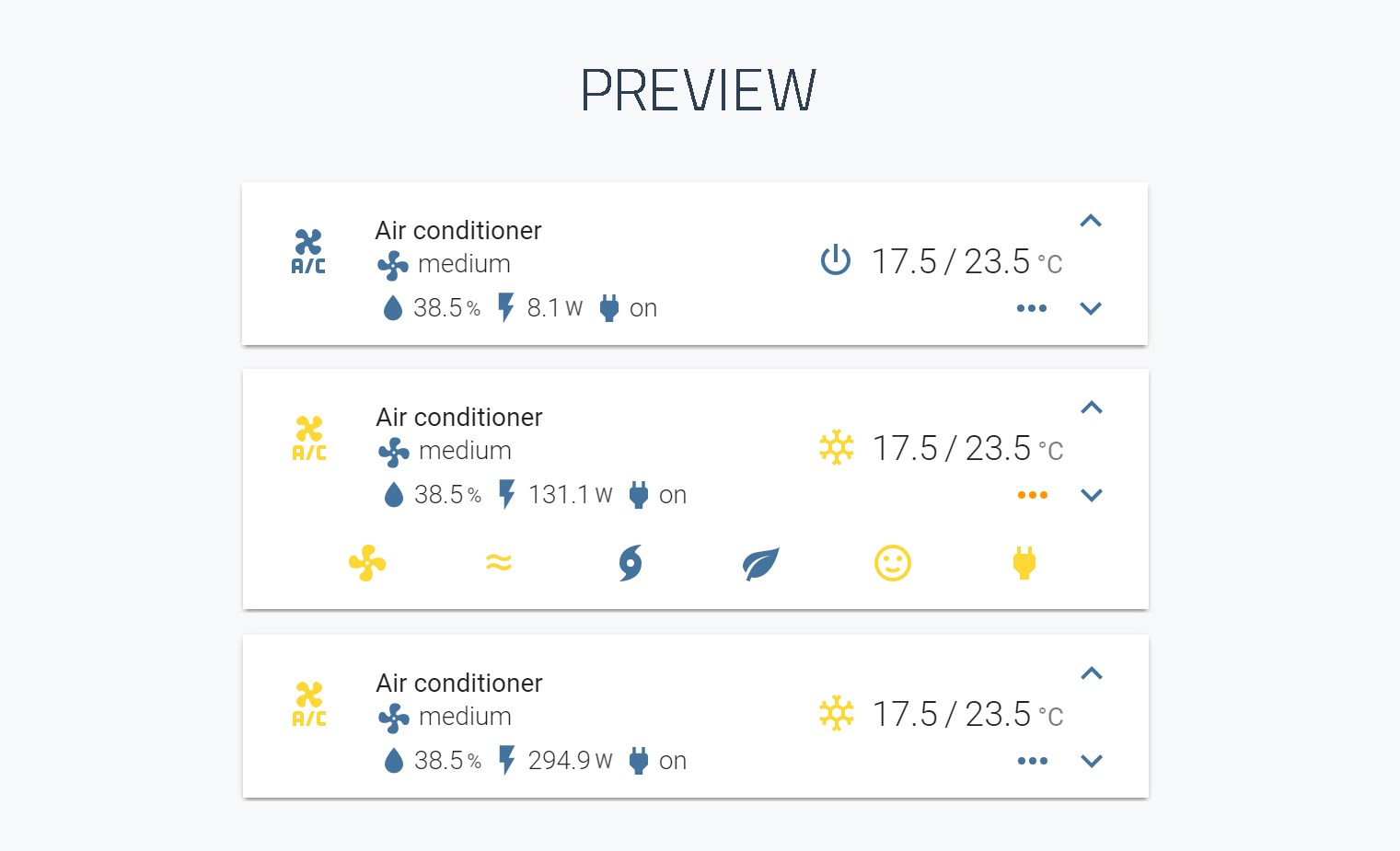
A minimalistic yet customizable climate card for [Home Assistant](https://home-assistant.io/) Lovelace UI.
Please ⭐️ this repo if you find it useful
## Notice
v2 is only compatible from version 2022.11 onwards
## Install
*This card is available in [HACS](https://github.com/hacs/integration) (Home Assistant Community Store)*
### Simple install
1. Download and copy `mini-climate-card-bundle.js` from the [latest release](https://github.com/artem-sedykh/mini-climate-card/releases/latest) into your `config/www` directory.
2. Add a reference to `mini-climate-card-bundle.js` inside your `ui-lovelace.yaml`.
```yaml
resources:
- url: /local/mini-climate-card-bundle.js?v=3.3.0
type: module
```
### CLI install
1. Move into your `config/www` directory
2. Grab `mini-climate-card-bundle.js`
```console
$ wget https://github.com/artem-sedykh/mini-climate-card/releases/latest/download/mini-climate-card-bundle.js
```
3. Add a reference to `mini-climate-card-bundle.js` inside your `ui-lovelace.yaml`.
```yaml
resources:
- url: /local/mini-climate-card-bundle.js?v=3.3.0
type: module
```
## Updating
1. Find your `mini-climate-card-bundle.js` file in `config/www` or wherever you ended up storing it.
2. Replace the local file with the latest one attached in the [latest release](https://github.com/artem-sedykh/mini-climate-card/releases/latest).
3. Change the version at the end of the card's reference url in your `ui-lovelace.yaml` - any new value will do, it is what makes the browser fetch the new file rather than the one it cached.
```yaml
resources:
- url: /local/mini-climate-card-bundle.js?v=3.3.0
type: module
```
*You may need to empty the browsers cache if you have problems loading the updated card.*
## Documentation
The full documentation is at
**[artem-sedykh.github.io/mini-climate-card](https://artem-sedykh.github.io/mini-climate-card/)**,
and the same pages are in [`docs/`](https://github.com/artem-sedykh/mini-climate-card/tree/master/docs).
| | |
|---|---|
| [Configuration](https://artem-sedykh.github.io/mini-climate-card/configuration/) | every card option, the toggle, and the theme variables |
| [Controls](https://artem-sedykh.github.io/mini-climate-card/controls/) | temperature, target temperature, hvac mode, fan mode |
| [Indicators](https://artem-sedykh.github.io/mini-climate-card/indicators/) | the read-only values under the entity name |
| [Buttons](https://artem-sedykh.github.io/mini-climate-card/buttons/) | buttons and dropdowns of your own |
| [Functions](https://artem-sedykh.github.io/mini-climate-card/functions/) | every option written as a function, its arguments and what it returns |
| [Tap action](https://artem-sedykh.github.io/mini-climate-card/tap-action/) | what a tap does, with examples |
| [Secondary info](https://artem-sedykh.github.io/mini-climate-card/secondary-info/) | the line under the name, and its types |
| [Examples](https://artem-sedykh.github.io/mini-climate-card/examples/) | a complete configuration |
| [AI assistants](https://artem-sedykh.github.io/mini-climate-card/ai-assistants/) | writing a card with Claude, Cursor or ChatGPT, and what to check in what it writes |
| [Development](https://artem-sedykh.github.io/mini-climate-card/development/) | building the card, and what to do when it errors |
| [Visual editor](https://artem-sedykh.github.io/mini-climate-card/visual-editor-parameters/) | which options the built-in UI editor exposes, and which stay YAML-only |
Links here are absolute on purpose: HACS renders this file outside GitHub and
resolves a relative path against a URL of its own, where it 404s.
## Contributing
[CONTRIBUTING.md](https://github.com/artem-sedykh/mini-climate-card/blob/master/CONTRIBUTING.md)
has what to know before opening a pull request, and
[AGENTS.md](https://github.com/artem-sedykh/mini-climate-card/blob/master/AGENTS.md)
is the long version: how the card is put together and what breaks it.
## License
This project is under the MIT license.
---
# Configuration
Source: https://artem-sedykh.github.io/mini-climate-card/configuration/
## Options
### Card options
| Name | Type | Default | Since | Description |
|-------------------------------------------|-------------------------------------|--------------|--------|---------------------------------------------------------------------------------------------------------------|
| type | string | **required** | v1.0.1 | `custom:mini-climate` |
| entity | string | **required** | v1.0.1 | An entity_id from an entity within the `climate` domain |
| name | string | optional | v1.0.1 | Override the entities friendly name |
| group | boolean | optional | v1.0.2 | Removes border, paddings, background color and box-shadow |
| icon | string | optional | v1.0.1 | Specify a custom icon from any of the available mdi icons |
| icon | object | optional | v3.3.0 | Icon object, see [icon](#icon) |
| icon: `template` | function | optional | v3.3.0 | Icon template function |
| icon: `style` | function | optional | v3.3.0 | Styles for the entity icon |
| swap_temperatures | boolean | optional | V2.1.1 | Swap the current and the target temperature in the card |
| hide_icon | boolean | optional | v3.0.0 | Hide the entity icon on the left, default value `False` |
| hide_icon | function | optional | v3.0.0 | Custom hide the entity icon function, see [hide_icon](#hide_icon) |
| hide_current_temperature | boolean | optional | V2.1.2 | Hide the current temperature in the card |
| hide_current_temperature | function | optional | V2.5.0 | Custom hide the current temperature in the card function |
| **toggle** | object | optional | v1.0.2 | Show/hide bottom buttons toggle button |
| toggle: `icon` | string | optional | v1.0.2 | Custom icon, default value `mdi:dots-horizontal` |
| toggle: `hide` | boolean | optional | v1.0.2 | Hide toggle button, default value `False` |
| toggle: `hide` | function | optional | v2.5.0 | Custom hide toggle button function |
| toggle: `default` | boolean | optional | v1.0.2 | Default toggle button state, default value `False` |
| **secondary_info** | object | optional | v1.1.0 | secondary_info config. [secondary info examples](https://artem-sedykh.github.io/mini-climate-card/secondary-info/) |
| secondary_info: `type` | string | optional | v1.1.0 | Available types: `last-changed, last-updated (v2.2.0), fan-mode, fan-mode-dropdown, hvac-mode, hvac-action` |
| secondary_info: `icon` | string | optional | v1.1.0 | Icon for types: `fan-mode, fan-mode-dropdown, hvac-mode`, `hvac-action` |
| secondary_info: `hide` | boolean | optional | v2.3.0 | Hide secondary_info, default value `False` |
| secondary_info: `hide` | function | optional | v2.5.0 | Custom hide secondary_info function. |
| secondary_info: `source` | object | optional | v1.2.1 | Source available types: `hvac-action` |
| secondary_info: `source:{item_name}` | object | optional | v1.2.1 | Source item name |
| secondary_info: `source:{item_name}:icon` | object | optional | v1.2.1 | Specify a custom icon from any of the available mdi icons |
| secondary_info: `source:{item_name}:name` | object | optional | v1.2.1 | Display name |
| **temperature** | object | optional | v1.0.1 | Current temperature configuration. [temperature examples](https://artem-sedykh.github.io/mini-climate-card/controls/#temperature) |
| temperature: `unit` | string | optional | v1.0.1 | Display unit, default `°C` |
| temperature: `round or fixed` | number | optional | v1.2.2 | Rounding or fixed value, default `round: 1` |
| temperature: `source` | object | optional | v1.0.1 | Data source for target temperature |
| temperature: `source:entity` | string | optional | v1.0.1 | entity_id, default current climate entity_id |
| temperature: `source:attribute` | string | optional | v1.0.1 | Default `current_temperature` |
| temperature: `tap_action` | [action object](https://artem-sedykh.github.io/mini-climate-card/tap-action/#tap-action-object) | optional | v3.3.0 | Action on click/tap of the current temperature, default `none`. Opens `temperature.source.entity` when one is set, see [tap_action](https://artem-sedykh.github.io/mini-climate-card/tap-action/#temperature-and-target-temperature) |
| **target_temperature** | object | optional | v1.0.1 | Target temperature configuration. [target_temperature examples](https://artem-sedykh.github.io/mini-climate-card/controls/#target_temperature) |
| target_temperature: `icons` | object | optional | v1.0.1 | Icons for temperature change buttons |
| target_temperature: `icons:up` | string | optional | v1.0.1 | Up icon, default `mdi:chevron-up` |
| target_temperature: `icons:down` | string | optional | v1.0.1 | Down icon, default `mdi:chevron-down` |
| target_temperature: `unit` | string | optional | v1.0.1 | Display unit, default `°C` |
| target_temperature: `min` | number | optional | v1.0.1 | Minimum temperature, the default value is taken from the attribute `min_temp` of the given entity |
| target_temperature: `max` | number | optional | v1.0.1 | Maximum temperature, the default value is taken from the attribute `max_temp` of the given entity |
| target_temperature: `step` | number | optional | v1.0.1 | Temperature change step, the default value is taken from the attribute `target_temp_step` of the given entity |
| target_temperature: `source` | object | optional | v1.0.1 | Data source for target temperature |
| target_temperature: `source:entity` | string | optional | v1.0.1 | entity_id, default current climate entity_id |
| target_temperature: `source:attribute` | string | optional | v1.0.1 | Default `temperature` |
| target_temperature: `tap_action` | [action object](https://artem-sedykh.github.io/mini-climate-card/tap-action/#tap-action-object) | optional | v3.3.0 | Action on click/tap of the target temperature, default `none`, see [tap_action](https://artem-sedykh.github.io/mini-climate-card/tap-action/#temperature-and-target-temperature) |
| target_temperature: `change_action` | function | optional | v1.0.1 | Custom temperature change function |
| **hvac_mode** | object | optional | v1.0.1 | HVAC mode. [hvac_mode examples](https://artem-sedykh.github.io/mini-climate-card/controls/#hvac_mode) |
| hvac_mode: `style` | function | optional | v1.0.1 | Custom style |
| hvac_mode: `change_action` | function | optional | v1.0.1 | Custom hvac_mode change function |
| hvac_mode: `state` | object | optional | v1.0.1 | Config to get hvac_mode state |
| hvac_mode: `hide` | boolean | optional | v1.2.3 | Hide hvac_mode, default value `False` |
| hvac_mode: `hide` | function | optional | v2.5.0 | Custom hide hvac_mode function |
| hvac_mode: `state:entity` | string | optional | v1.1.0 | hvac_mode entity_id |
| hvac_mode: `state:attribute` | string | optional | v1.1.0 | hvac_mode attribute |
| hvac_mode: `state:mapper` | function | optional | v1.1.0 | State processing function |
| hvac_mode: `active` | function | optional | v1.1.0 | Active function |
| hvac_mode: `source` | object | optional | v1.0.1 | Data |
| hvac_mode: `source:__filter` | function | optional | v1.1.0 | [Filter function](https://artem-sedykh.github.io/mini-climate-card/functions/#source__filter) |
| hvac_mode: `source:item` | object | optional | v1.0.1 | `item` - mode name e.g. cool, heat, off, etc. |
| hvac_mode: `source:item:icon` | string | optional | v1.0.1 | Specify a custom icon from any of the available mdi icons |
| hvac_mode: `source:item:name` | string | optional | v1.0.1 | Display name |
| hvac_mode: `source:item:hide` | boolean | optional | v2.5.0 | Hide source, default value `False` |
| hvac_mode: `source:item:order` | number | optional | v1.2.5 | Sort order |
| **fan_mode** | object | optional | v1.0.1 | Fan operation for climate device. [fan_mode examples](https://artem-sedykh.github.io/mini-climate-card/controls/#fan_mode) |
| fan_mode: `icon` | string | optional | v1.0.1 | Specify a custom icon from any of the available mdi icons |
| fan_mode: `icon` | string or function | optional | v3.1.0 | A `template` function as in [icons](https://artem-sedykh.github.io/mini-climate-card/indicators/#icon-template); the dropdown under the name uses this too, see [fan-mode-dropdown](https://artem-sedykh.github.io/mini-climate-card/secondary-info/#fan-mode-dropdown) |
| fan_mode: `order` | number | optional | v1.0.1 | Sort order, default value `0` |
| fan_mode: `location` | string | optional | v1.0.1 | Allows you to display buttons on the main panel, types `main, bottom`, default `bottom` |
| fan_mode: `hide` | number | optional | v1.0.1 | Hide button, default value `False` |
| fan_mode: `hide` | function | optional | v2.5.0 | Custom hide button function |
| fan_mode: `style` | function | optional | v1.0.1 | Style |
| fan_mode: `disabled` | function | optional | v1.0.1 | Disabled function |
| fan_mode: `active` | function | optional | v1.0.1 | Active |
| fan_mode: `change_action` | function | optional | v1.0.1 | Custom fan_mode change function |
| fan_mode: `state` | object | optional | v1.0.1 | Config to get fan_mode state |
| fan_mode: `state:entity` | string | optional | v1.0.1 | fan_mode entity_id |
| fan_mode: `state:attribute` | string | optional | v1.0.1 | fan_mode attribute, default `fan_mode` |
| fan_mode: `source` | object | optional | v1.0.1 | Source for drop down list |
| fan_mode: `source:item` | string | optional | v1.0.1 | `item` - mode name e.g. auto, low, medium... |
| fan_mode: `source:__filter` | function | optional | v1.0.1 | [Source filter](https://artem-sedykh.github.io/mini-climate-card/functions/#source__filter) |
| **indicators** | object | optional | v1.0.1 | Any indicators, [examples](https://artem-sedykh.github.io/mini-climate-card/indicators/) |
| indicators: `name` | object | optional | v1.0.1 | The name of your indicator see [examples](https://artem-sedykh.github.io/mini-climate-card/indicators/) |
| indicators: `name:icon` | string | optional | v1.0.1 | Specify a custom icon from any of the available mdi icons |
| indicators: `name:icon` | object | optional | v1.0.1 | Icon object |
| indicators: `name:icon:template` | function | optional | v1.0.1 | Icon template function |
| indicators: `name:icon:style` | function | optional | v1.0.1 | Styles |
| indicators: `name:value` | object | optional | v1.0.1 | Value object |
| indicators: `name:value:style` | function | optional | v1.0.1 | Styles |
| indicators: `name:unit` | string | optional | v1.0.1 | Display unit |
| indicators: `name:unit` | function | optional | v3.1.0 | [Unit template](https://artem-sedykh.github.io/mini-climate-card/functions/#unit_template) |
| indicators: `name:round` | number | optional | v1.0.1 | Rounding number value |
| indicators: `name:fixed` | number | optional | v3.3.0 | Decimals to keep, trailing zeros and all, see [round and fixed](#round-and-fixed) |
| indicators: `name:hide` | boolean | optional | v2.5.0 | Hide indicator, default value `False` |
| indicators: `name:hide` | function | optional | v2.5.0 | Custom hide indicator function |
| indicators: `name:source` | number | optional | v1.0.1 | Data source |
| indicators: `name:source:entity` | string | optional | v1.0.1 | Indicator entity_id |
| indicators: `name:source:attribute` | string | optional | v1.0.1 | Entity attribute |
| indicators: `name:source:mapper` | function | optional | v1.0.1 | Value processing function |
| indicators: `name:tap_action` | [action object](https://artem-sedykh.github.io/mini-climate-card/tap-action/#tap-action-object) | true | v1.1.0 | Action on click/tap |
| **buttons** | object | optional | v1.0.1 | Any buttons, [example](https://artem-sedykh.github.io/mini-climate-card/buttons/) |
| buttons: `name` | object | optional | v1.0.1 | The name of your button see examples |
| buttons: `name:icon` | string | optional | v1.0.1 | Specify a custom icon from any of the available mdi icons |
| buttons: `name:icon` | string or function | optional | v3.1.0 | Specify a custom icon from any of the available mdi icons, or a `template` function as in [icons](https://artem-sedykh.github.io/mini-climate-card/indicators/#icon-template) |
| buttons: `name:type` | string | optional | v1.0.1 | `dropdown` or `button` default `button` |
| buttons: `name:order` | number | optional | v1.0.1 | Sort order |
| buttons: `name:location` | string | optional | v1.2.1 | Allows you to display buttons on the main panel, types `main, bottom`, default `bottom` |
| buttons: `name:state` | object | optional | v1.0.1 | Config to get button state |
| buttons: `name:state:entity` | string | optional | v1.0.1 | Button entity_id |
| buttons: `name:state:attribute` | string | optional | v1.0.1 | Entity attribute |
| buttons: `name:state:mapper` | function | optional | v1.0.1 | State processing function |
| buttons: `name:disabled` | function | optional | v1.0.1 | Calc disabled button |
| buttons: `name:hide` | boolean | optional | v2.5.0 | Hide button, default value `False` |
| buttons: `name:hide` | function | optional | v2.5.0 | Custom hide button function |
| buttons: `name:active` | function | optional | v1.0.1 | For type `dropdown` |
| buttons: `name:source` | object | optional | v1.0.1 | For type `dropdown` |
| buttons: `name:source:item` | string | optional | v1.0.1 | Source item, format horizontal: horizontal |
| buttons: `name:source:__filter` | function | optional | v1.0.1 | [Filter function](https://artem-sedykh.github.io/mini-climate-card/functions/#source__filter) |
| buttons: `name:change_action` | function | optional | v1.0.1 | For type `dropdown` |
| buttons: `name:toggle_action` | function | optional | v1.0.1 | For type `button` |
| buttons: `name:style` | function | optional | v1.0.1 | Styles |
| tap_action | [action object](https://artem-sedykh.github.io/mini-climate-card/tap-action/#tap-action-object) | true | v1.0.4 | Action on click/tap, [tap_action](https://artem-sedykh.github.io/mini-climate-card/tap-action/#tap-action-example) |
| scale | number | optional | v1.0.1 | UI scale modifier, default is `1`. See [A bigger card](https://artem-sedykh.github.io/mini-climate-card/examples/#a-bigger-card) |
### icon
The left entity icon. A string is a fixed mdi name. An object is the same
`{ template, style }` [an indicator already takes](https://artem-sedykh.github.io/mini-climate-card/functions/#icon_template):
the glyph and its colour follow the climate entity, which is what
[#38](https://github.com/artem-sedykh/mini-climate-card/issues/38) and
[#42](https://github.com/artem-sedykh/mini-climate-card/issues/42) asked for.
| Name | Type | execution context | arguments | return type |
|-------------|----------|-------------------|---------------------------|----------------------|
| `template` | function | icon config | climate_entity, hvac_mode | string |
| `style` | function | icon config | climate_entity, hvac_mode | object |
`climate_entity` - climate entity
`hvac_mode` - current hvac_mode
Arguments match `hide_icon`: the left icon has no value of its own, so it
reads the climate entity. Extra keys on the object are `this.` from the
template, the way `items` works on a button icon.
A string `icon` still tints the glyph while the unit is on (`isActive` follows
HVAC mode). When `style` is present it owns the colour instead, so idle can
look idle while the mode stays `heat`. A style that does not set `color`
leaves the icon uncoloured (`--mc-icon-color`): the tint is dropped on the
presence of `style`, not on the presence of a colour in it. The entity icon's
colour rule is not `!important`, unlike `hvac_mode.style`.
```yaml
# a fixed glyph
type: custom:mini-climate
entity: climate.thermostat
icon: mdi:radiator
# glyph and colour from hvac_action
type: custom:mini-climate
entity: climate.thermostat
icon:
template: >
(entity) => entity.attributes.hvac_action === 'heating'
? 'mdi:radiator'
: 'mdi:radiator-off'
style: >
(entity) => ({
color: entity.attributes.hvac_action === 'heating'
? 'var(--mc-icon-active-color)'
: 'var(--mc-icon-color)',
})
```
### round and fixed
Both shorten a reading. They differ in one case: when the reading has no
fraction left to show.
- `round: 1` - a humidity of `48.02` reads **`48`**, and `48.37` reads `48.4`
- `fixed: 1` - `48.02` reads **`48.0`**, and `48.37` reads `48.4`
That is the whole difference, and it is not about the number. The width of the
value changes with it, and everything drawn to the right of it moves along - so
in a column of cards the indicators stop lining up. See
[Indicators that line up in a stack](https://artem-sedykh.github.io/mini-climate-card/examples/#indicators-that-line-up-in-a-stack)
for what that looks like ([#163](https://github.com/artem-sedykh/mini-climate-card/issues/163)).
`temperature` has taken `fixed` since v1.2.2; an indicator takes it from
v3.3.0. When both are written, `fixed` wins.
Neither touches a reading that is not a number, so an indicator whose sensor is
`unavailable` reads `unavailable` rather than `NaN`
([#298](https://github.com/artem-sedykh/mini-climate-card/issues/298)).
If you write templates on the value, note that `fixed` hands them a string and
`round` hands them a number. Comparisons still work either way, because
JavaScript converts (`value > 50`), but a call like `value.toFixed(1)` does not
exist on a string.
### hide_icon
Hides the entity icon on the left of the card and gives the space to the name.
| Name | Type | execution context | arguments | return type |
|-------------|----------|-------------------|---------------------------|-------------|
| `hide_icon` | function | card config | climate_entity, hvac_mode | boolean |
`climate_entity` - climate entity
`hvac_mode` - current hvac_mode
```yaml
# always
type: custom:mini-climate
entity: climate.my_ac
hide_icon: true
# only while the unit is off
type: custom:mini-climate
entity: climate.my_ac
hide_icon: >
(climate_entity) => climate_entity.state === 'off'
```
### toggle
#### toggle functions
| Name | Type | execution context | arguments | return type |
|--------|----------|-------------------|---------------------------|-------------|
| `hide` | function | toggle config | climate_entity, hvac_mode | boolean |
`climate_entity` - climate entity
`hvac_mode` - current hvac_mode
```yaml
type: custom:mini-climate
entity: climate.dahatsu
toggle:
default: true
icon: 'mdi:fan'
hide: >
(climate_entity) => !climate_entity.attributes.turbo_al
```
## Theme variables
The following variables are available and can be set in your theme to change the appearence of the card.
Can be specified by color name, hexadecimal, rgb, rgba, hsl, hsla, basically anything supported by CSS.
| name | Default | Description |
|---------------------------------|-----------------------------------------------------------------------|---------------------------------|
| mini-climate-name-font-weight | 400 | Font weight of the entity name |
| mini-climate-info-font-weight | 300 | Font weight of the states |
| mini-climate-icon-color | var(--mini-climate-base-color, var(--paper-item-icon-color, #44739e)) | The color for icons |
| mini-climate-button-color | var(--paper-item-icon-color, #44739e) | The color for buttons icons |
| mini-climate-accent-color | var(--accent-color) | The accent color of UI elements |
| mini-climate-base-color | var(--primary-text-color, #000) | The color of base text, and what the icon color falls back to |
| mini-climate-background-opacity | 1 | Opacity of the background |
| mini-climate-scale | 1 | Scale of the card |
| mini-climate-card-box-shadow | var(--ha-card-box-shadow, none) | The card shadow |
The card also honours Home Assistant's own card variables - `ha-card-background`,
`ha-card-border-radius`, `ha-card-border-width` and `ha-card-border-color`. Those
are what the background of the card is made of, and setting `background` on
`ha-card` directly does not reach it: see
[A translucent card](https://artem-sedykh.github.io/mini-climate-card/examples/#a-translucent-card).
---
# Controls
Source: https://artem-sedykh.github.io/mini-climate-card/controls/
## temperature
> Functions available:
| Name | Type | execution context | arguments | return type |
|----------------------------|----------|-------------------|---------------------------------------------------------|-------------|
| `hide_current_temperature` | function | | value, entity, target_entity, climate_entity, hvac_mode | boolean |
`value` - temperature value
`entity` - temperature entity
`target_entity` - target temperature entity
`climate_entity` - climate entity
`hvac_mode` - current hvac_mode
> Configuration example for the temperature:
```yaml
type: custom:mini-climate
entity: climate.my_ac
hide_current_temperature: >
(value) => value < 20
temperature:
unit: '°C'
round: 1
# use an external temperature sensor
source:
entity: sensor.temperature
# open that sensor's history when the reading is tapped, off by default
tap_action: more-info
```
See [tap action](https://artem-sedykh.github.io/mini-climate-card/tap-action/#temperature-and-target-temperature) for what
`tap_action` accepts here.
## target_temperature
> Functions available for the target_temperature:
| Name | Type | execution context | arguments | return type |
|-----------------|----------|---------------------------|-------------------------------|-------------|
| `change_action` | function | target_temperature config | value, entity, climate_entity | promise |
`value` - target_temperature value
`entity` - target_temperature entity
`climate_entity` - climate entity
**execution context methods:**
| Name | arguments | description | return type |
|----------------|---------------------------|---------------------------------------------------------|-------------|
| `toggle_state` | state | toggle state, example: `this.toggle_state('on') => off` | string |
| `call_service` | domain, service, options, | call Home Assistant service | promise |
> Configuration example for the target_temperature:
```yaml
type: custom:mini-climate
entity: climate.my_ac
target_temperature:
icons:
up: mdi:chevron-up
down: mdi:chevron-down
unit: '°C'
min: 16
max: 31
step: 0.5
tap_action: more-info
change_action: >
(value, entity) => this.call_service('climate', 'set_temperature', { entity_id: entity.entity_id, temperature: value })
```
## hvac_mode
> Functions available for the hvac_mode:
| Name | Type | execution context | arguments | return type |
|-------------------|----------|-------------------|---------------------------------------|--------------------------------------|
| `state:mapper` | function | hvac_mode config | state, entity, climate_entity | any |
| `active` | function | hvac_mode config | state, entity, climate_entity | boolean |
| `change_action` | function | hvac_mode config | selected, entity, climate_entity | any |
| `style` | function | hvac_mode config | value, entity, climate_entity | object |
| `source:__filter` | function | hvac_mode config | source, state, entity, climate_entity | object({ id..., name...,... }) array |
| `hide` | function | hvac_mode config | state, entity, climate_entity | boolean |
`state` - current hvac state
`selected` - selected value
`entity` - hvac entity
`climate_entity` - current climate entity
**execution context methods:**
| Name | arguments | description | return type |
|----------------|---------------------------|---------------------------------------------------------|-------------|
| `toggle_state` | state | toggle state, example: `this.toggle_state('on') => off` | string |
| `call_service` | domain, service, options, | call Home Assistant service | promise |
> Configuration example for the hvac_mode:
```yaml
type: custom:mini-climate
entity: climate.my_ac
hvac_mode:
style: "(value, entity) => ({ color: 'black !important' })"
hide: >
(state) => state === 'dry'
source:
'off':
icon: mdi:power
name: 'off'
heat:
icon: mdi:weather-sunny
name: heat
auto:
icon: mdi:cached
name: auto
cool:
icon: mdi:snowflake
name: cool
dry:
icon: mdi:water
name: dry
fan_only:
icon: mdi:fan
name: fan
change_action: >
(selected, entity) => this.call_service('climate', 'set_hvac_mode', { entity_id: entity.entity_id, hvac_mode: selected })
```
The `!important` on that `color` is not decoration. While the climate entity is
on, the card marks the mode button active and paints it with a rule that
carries one already, so a plain `color` from the template is dropped - see
[style](https://artem-sedykh.github.io/mini-climate-card/functions/#style).
## fan_mode
> Functions available for the fan_mode:
| Name | Type | execution context | arguments | return type |
|-------------------|----------|-------------------|---------------------------------------------------|----------------------------------|
| `state:mapper` | function | button config | state, entity, climate_entity, hvac_mode | any |
| `source:__filter` | function | button config | source, state, entity, climate_entity, hvac_mode | object({ id..., name... }) array |
| `active` | function | button config | value, entity, climate_entity, hvac_mode | boolean |
| `disabled` | function | button config | value, entity, climate_entity, hvac_mode | boolean |
| `style` | function | button config | value, entity, climate_entity, hvac_mode | object |
| `change_action` | function | button config | selected_value, state, entity, climate_entity, hvac_mode | promise |
| `hide` | function | button config | state, entity, climate_entity, hvac_mode | boolean |
| [`icon`](https://artem-sedykh.github.io/mini-climate-card/functions/#icon_template) | function | button config | state, entity, climate_entity, hvac_mode | string |
`state` - current button state value
`entity` - button entity
`climate_entity` - climate entity
`hvac_mode` - current hvac_mode
`source` - dropdown source object array: [ { id: 'id', name: 'name' }, ... ]
`selected_value` - selected dropdown value
**execution context methods:**
| Name | arguments | description | return type |
|----------------|---------------------------|---------------------------------------------------------|-------------|
| `toggle_state` | sate | toggle state, example: `this.toggle_state('on') => off` | string |
| `call_service` | domain, service, options, | call Home Assistant service | promise |
> Configuration example for the fan_mode:
```yaml
type: custom:mini-climate
entity: climate.my_ac
fan_mode:
hide: >
(state) => state === 'low'
icon: mdi:fan
# where the dropdown is drawn: `bottom` (behind the toggle) by default,
# `main` puts it in the control row beside the mode icon
location: main
order: 0
active: (state, entity) => entity.state !== 'off'
source:
auto: auto
low: low
medium: medium
high: high
# filter usage example
__filter: >
(source, state, entity) => entity.attributes
.fan_modes_al.map(fan_mode => source.find(s => s.id === fan_mode))
.filter(fan_mode=>fan_mode)
change_action: >
(selected, state, entity) => this.call_service('climate', 'set_fan_mode', { entity_id: entity.entity_id, fan_mode: selected })
```
`location` is the option `fan_mode` shares with every other button - see
[Buttons](https://artem-sedykh.github.io/mini-climate-card/buttons/#location) for what the two rows are, and
[The fan mode in the top row](https://artem-sedykh.github.io/mini-climate-card/examples/#the-fan-mode-in-the-top-row) for the
one caveat: the secondary info line shows the fan mode by default, so a card
that moves the dropdown up says it twice.
---
# Indicators
Source: https://artem-sedykh.github.io/mini-climate-card/indicators/
> The indicators display additional information on the card, for example, you can display humidity, consumption, etc.
> Adding a simple indicator:
```yaml
type: custom:mini-climate
entity: climate.my_ac
indicators:
humidity:
icon: mdi:water
unit: '%'
round: 1
source:
entity: sensor.humidity
```
## round and fixed
`round` drops everything past the decimals you asked for. `fixed` always shows
that many, so a reading of `48.02` stays `48.0` instead of turning into `48`:
```yaml
indicators:
humidity:
icon: mdi:water-percent
unit: "%"
fixed: 1
source:
entity: sensor.humidity
```
Which matters when several cards sit above one another - the value's width
stops changing with the reading, so the indicators line up. See
[round and fixed](https://artem-sedykh.github.io/mini-climate-card/configuration/#round-and-fixed) and the
[recipe](https://artem-sedykh.github.io/mini-climate-card/examples/#indicators-that-line-up-in-a-stack).
## indicator functions
> Consider configuring an indicator using javascript
> Functions available for the indicator:
| Name | Type | execution context | arguments | return type |
|-----------------|----------|-------------------|------------------------------------------|-------------|
| [`source:mapper`](https://artem-sedykh.github.io/mini-climate-card/functions/#state_mapper) | function | indicator config | value, entity, climate_entity, hvac_mode | any |
| [`icon:template`](https://artem-sedykh.github.io/mini-climate-card/functions/#icon_template) | function | indicator config | value, entity, climate_entity, hvac_mode | string |
| [`icon:style`](https://artem-sedykh.github.io/mini-climate-card/functions/#icon_style) | function | indicator config | value, entity, climate_entity, hvac_mode | object |
| [`value:style`](https://artem-sedykh.github.io/mini-climate-card/functions/#value_style) | function | indicator config | value, entity, climate_entity, hvac_mode | object |
| [`unit:template`](https://artem-sedykh.github.io/mini-climate-card/functions/#unit_template) | function | indicator config | mapped_value, value, entity, climate_entity, hvac_mode | string |
| [`hide`](https://artem-sedykh.github.io/mini-climate-card/functions/#hide) | function | indicator config | value, entity, climate_entity, hvac_mode | boolean |
`value` - current indicator value
`entity` - indicator entity
`climate_entity` - climate entity
`hvac_mode` - current hvac_mode
What `this` is, including extra keys and `entity_config`, is
[`this`](https://artem-sedykh.github.io/mini-climate-card/functions/#this). The mapper below uses it as `this.source.values`.
## source mapper
> Using the mapper function, you can change the indicator value:
```yaml
type: custom:mini-climate
entity: climate.my_ac
indicators:
power:
icon: mdi:power-plug
source:
values:
'on': 'power is on!'
'off': 'power is off!'
entity: switch.ac_power
# since the current execution context is an indicator config, we can use this.source.values to get values
mapper: value => this.source.values[value]
# example of using all function arguments
# mapper: >
# (value, entity, climate_entity, hvac_mode) => {
# console.log(value);
# console.log(entity);
# console.log(climate_entity);
# console.log(hvac_mode);
# console.log(this);
# return ...
# }
```
## icon template
> The indicator icon can be calculated dynamically
for example:
```yaml
type: custom:mini-climate
entity: climate.my_ac
indicators:
humidity:
icon:
template: >
(value) => (value > 30 ? 'mdi:weather-rainy' : 'mdi:water')
unit: '%'
round: 1
source:
entity: sensor.humidity
```
## icon style
> You can also set custom styles.
for example:
```yaml
type: custom:mini-climate
entity: climate.my_ac
indicators:
humidity:
icon:
template: () => 'mdi:water'
style: >
(value) => (value > 30 ? { color: 'red'} : {})
unit: '%'
round: 1
source:
entity: sensor.humidity
```
## value style
> You can also set custom styles.
for example:
```yaml
type: custom:mini-climate
entity: climate.my_ac
indicators:
humidity:
value:
style: >
(value) => (value > 30 ? { color: 'red'} : {})
unit: '%'
round: 1
source:
entity: sensor.humidity
```
## Hide
> You can also hide based on state.
for example:
```yaml
type: custom:mini-climate
entity: climate.my_ac
indicators:
humidity:
hide: >
(value) => value < 20
unit: '%'
round: 1
source:
entity: sensor.humidity
```
---
# Buttons
Source: https://artem-sedykh.github.io/mini-climate-card/buttons/
> You can add various buttons, supported types: button and dropdown
## buttons functions
| Name | Type | execution context | arguments | return type |
|-------------------|----------|-------------------|---------------------------------------------------|----------------------------------|
| [`state:mapper`](https://artem-sedykh.github.io/mini-climate-card/functions/#state_mapper) | function | button config | state, entity, climate_entity, hvac_mode | any |
| [`source:__filter`](https://artem-sedykh.github.io/mini-climate-card/functions/#source__filter) | function | button config | source, state, entity, climate_entity, hvac_mode | object({ id..., name... }) array |
| [`active`](https://artem-sedykh.github.io/mini-climate-card/functions/#active) | function | button config | value, entity, climate_entity, hvac_mode | boolean |
| [`disabled`](https://artem-sedykh.github.io/mini-climate-card/functions/#disabled) | function | button config | value, entity, climate_entity, hvac_mode | boolean |
| [`style`](https://artem-sedykh.github.io/mini-climate-card/functions/#style) | function | button config | value, entity, climate_entity, hvac_mode | object |
| [`toggle_action`](https://artem-sedykh.github.io/mini-climate-card/functions/#toggle_action) | function | button config | state, entity, climate_entity, hvac_mode | promise |
| [`change_action`](https://artem-sedykh.github.io/mini-climate-card/functions/#change_action) | function | button config | selected_value, state, entity, climate_entity, hvac_mode | promise |
| [`hide`](https://artem-sedykh.github.io/mini-climate-card/functions/#hide) | function | button config | state, entity, climate_entity, hvac_mode | boolean |
| [`icon`](https://artem-sedykh.github.io/mini-climate-card/functions/#icon_template) | function | button config | state, entity, climate_entity, hvac_mode | string |
`state` - current button state value
`entity` - button entity
`climate_entity` - climate entity
`hvac_mode` - current hvac_mode
`source` - dropdown source object array: [ { id: 'id', name: 'name' }, ... ]
`selected_value` - selected dropdown value
**execution context methods:**
| Name | arguments | description | return type |
|----------------|---------------------------|---------------------------------------------------------|-------------|
| `toggle_state` | state | toggle state, example: `this.toggle_state('on') => off` | string |
| `call_service` | domain, service, options, | call Home Assistant service | promise |
| `entity_config` | | the whole card configuration | object |
A key the card does not recognise is on `this` as well - that is how
`icon.items` is read. See [`this`](https://artem-sedykh.github.io/mini-climate-card/functions/#this).
## dropdown
> Consider an example swing_mode configuration:
```yaml
type: custom:mini-climate
entity: climate.my_ac
buttons:
swing_mode:
type: dropdown
icon: mdi:approximately-equal
state:
attribute: swing_mode
active: state => state !== 'off'
source:
'off': Off
horizontal: On
change_action: >
(selected, state, entity) => this.call_service('climate', 'set_swing_mode', { entity_id: entity.entity_id, swing_mode: selected })
```
A `dropdown` button can also take an `icon` template, the same way an indicator
can: the icon it shows then follows the button state, which is what a preset
mode a user picks against two or three modes wants.
```yaml
type: custom:mini-climate
entity: climate.my_ac
buttons:
preset_mode:
type: dropdown
icon:
template: >
(state) => state === 'boost' ? 'mdi:fan-chevron-up'
: state === 'eco' ? 'mdi:fan-chevron-down'
: 'mdi:fan-speed-3'
state:
attribute: preset_mode
active: state => state !== 'none'
source:
none: Plain
boost: Turbo
eco: Quiet
change_action: >
(selected, state, entity) => this.call_service('climate', 'set_preset_mode', { entity_id: entity.entity_id, preset_mode: selected })
```
## button
> Consider the example of adding buttons:
```yaml
type: custom:mini-climate
entity: climate.my_ac
buttons:
power:
icon: mdi:power-plug
state:
entity: switch.ac_power
# for the button type, if no toggle_action is specified, the switch.toggle method is called
```
```yaml
type: custom:mini-climate
entity: climate.my_ac
buttons:
turbo:
icon: mdi:weather-hurricane
hide: >
(state, entity) => !entity.attributes.turbo_al
state:
attribute: turbo
mapper: "state => (state ? 'on': 'off')"
disabled: (state, entity) => !entity.attributes.turbo_al
toggle_action: >
(state) => this.call_service('mqtt', 'publish', { payload: this.toggle_state(state), topic: 'my_ac/turbo/set', retain: false, qos: 1 })
```
## location
A button is drawn behind the toggle at the bottom of the card, which is opened
by the chevron on its right. `location: main` draws it in the top row instead -
beside the mode icon and the temperature, visible without opening anything.
`order` sorts the buttons inside whichever row they are in, and the main row is
drawn before the mode icon.
```yaml
type: custom:mini-climate
entity: climate.my_ac
buttons:
# in the top row, always visible
turbo:
icon: mdi:weather-hurricane
location: main
order: 0
state:
attribute: turbo
mapper: "state => (state ? 'on': 'off')"
# and behind the toggle, which is where a button goes by default
eco:
icon: mdi:leaf
state:
attribute: eco
mapper: "state => (state ? 'on': 'off')"
```
`fan_mode` takes the same option - it is a button under that id - and the top
row is what a card whose toggle is hidden has left. Both moves are recipes of
their own: [a button in place of the mode
dropdown](https://artem-sedykh.github.io/mini-climate-card/examples/#a-press-instead-of-the-mode-dropdown), and [the fan mode
in the top row](https://artem-sedykh.github.io/mini-climate-card/examples/#the-fan-mode-in-the-top-row).
---
# Functions
Source: https://artem-sedykh.github.io/mini-climate-card/functions/
A card configuration is YAML, but several options are **functions**, written as
arrow functions in the YAML. The card parses their text, binds a context to
`this`, and calls them at the right moment - when an indicator value changes,
when a button is pressed, when a mode list is assembled.
Every function gets the same four arguments, in this order, whatever it is:
| argument | what it is |
|---|---|
| `state` | the value as the card reads it - for an indicator its current value, for a button its state (after `state:mapper`, if any) |
| `entity` | the entity the option reads (the button's own entity, or the climate one) |
| `climate_entity` | the card's climate entity |
| `hvac_mode` | the mode the card is showing (`{ id, name }`, or nothing if none is selected) |
Functions that take something instead of, or in addition to, `state` are noted
below. What `this` is - the option's own YAML, extra keys included - is
[`this`](#this).
## `this` {#this}
`this` is the option the function belongs to - the YAML, as written. A key the
card does not recognise is data, not an error: a topic, a price, a lookup
table. That is the extension point, and it is why `icon.items` works.
Because the context is the **whole** option, a nested map keeps its path.
`this.items` would look on the button, where there is no such key:
```yaml
type: custom:mini-climate
entity: climate.dahatsu
fan_mode:
hide: true
icon:
items:
auto: 'mdi:fan-auto'
low: 'mdi:fan-speed-1'
medium: 'mdi:fan-speed-2'
high: 'mdi:fan-speed-3'
template: >
(state) => this.icon.items[state] || 'mdi:fan'
```
The exception is the card's own `icon`: there `this` is the icon object, so
extra keys are `this.items`. See [fan-mode-dropdown](https://artem-sedykh.github.io/mini-climate-card/secondary-info/#fan-mode-dropdown)
and [icon](https://artem-sedykh.github.io/mini-climate-card/configuration/#icon).
The card then adds three names of its own:
| name | what it is | on |
|---|---|---|
| `toggle_state(state)` | the opposite of `on` / `off` | buttons, indicators, target temperature |
| `call_service(domain, service, options)` | a Home Assistant service call | buttons and target temperature |
| `entity_config` | the whole card configuration | the same, and the entity icon |
An indicator does not get `call_service`: it displays. A `secondary_info` or
`toggle` hide function sees only its own YAML.
## source:__filter {#source__filter}
The list a dropdown shows comes from `source`. `source:__filter` is a function
that takes that list and returns a **filtered** one.
| argument | what it is |
|---|---|
| `source` | the configured options, as an array of `{ id, name }` |
| `state` | the current state (after `state:mapper`) |
| `entity`, `climate_entity`, `hvac_mode` | as above |
Returns an array of `{ id, name }` - the options that stay.
### Why it is there
The list is not always valid as configured. A climate entity reports the modes
its integration knows; the ones that make sense for the current state are not
always all of them. Filtering by the state is how a card shows only the options
that apply now.
```yaml
type: custom:mini-climate
entity: climate.my_ac
buttons:
swing_mode:
type: dropdown
icon: mdi:approximately-equal
state:
attribute: swing_mode
source:
'off': Off
horizontal: On
vertical: Auto
__filter: source => source.filter(option => option.id !== 'vertical')
change_action: >
(selected, state, entity) => this.call_service('climate', 'set_swing_mode', { entity_id: entity.entity_id, swing_mode: selected })
```
## state:mapper {#state_mapper}
Turns the raw value a button or indicator reads into the value its functions
then see. This is how a switch's `on`/`off` becomes a boolean, or how a sensor
reading is shortened before it is shown.
| argument | what it is |
|---|---|
| `state` | the raw state or attribute value |
Returns the mapped value.
```yaml
type: custom:mini-climate
entity: climate.my_ac
buttons:
turbo:
icon: mdi:weather-hurricane
state:
attribute: turbo
mapper: state => (state ? 'on' : 'off')
```
## icon:template {#icon_template}
The icon an indicator or button shows, computed from the value. This is the
option behind [#49](https://github.com/artem-sedykh/mini-climate-card/issues/49):
an icon that follows the state rather than being fixed. `fan_mode` is a button,
so the same form applies there - including the dropdown under the name, see
[fan-mode-dropdown](https://artem-sedykh.github.io/mini-climate-card/secondary-info/#fan-mode-dropdown).
The card's own `icon` takes the same object. Arguments there are
`(climate_entity, hvac_mode)`, matching `hide_icon`, because the left icon has
no value of its own. See [icon](https://artem-sedykh.github.io/mini-climate-card/configuration/#icon).
| argument | what it is |
|---|---|
| `state` | the value the option reads (mapped, for a button) |
Returns an `mdi:` icon name.
```yaml
type: custom:mini-climate
entity: climate.my_ac
buttons:
preset_mode:
type: dropdown
icon:
template: >
(state) => state === 'boost' ? 'mdi:fan-chevron-up'
: state === 'eco' ? 'mdi:fan-chevron-down'
: 'mdi:fan-speed-3'
state:
attribute: preset_mode
active: state => state !== 'none'
source:
none: Plain
boost: Turbo
eco: Quiet
change_action: >
(selected, state, entity) => this.call_service('climate', 'set_preset_mode', { entity_id: entity.entity_id, preset_mode: selected })
```
## icon:style {#icon_style}
CSS to apply to the icon element, by the value.
```yaml
type: custom:mini-climate
entity: climate.my_ac
indicators:
power:
icon: mdi:power-plug
icon:
style: (value) => value === 'on' ? { color: 'green' } : {}
source:
entity: switch.ac_power
```
## value:style {#value_style}
CSS to apply to the indicator's value element, by the value. This is how a
value is hidden or coloured without `card_mod`.
```yaml
type: custom:mini-climate
entity: climate.my_ac
indicators:
humidity:
icon: mdi:water
unit: '%'
source:
entity: sensor.ac_humidity
value:
style: value => value > 70 ? { color: 'red' } : {}
```
## hide
Whether the option is shown at all. Returns a boolean.
| argument | what it is |
|---|---|
| `state` | the value (mapped, for a button) |
```yaml
type: custom:mini-climate
entity: climate.my_ac
buttons:
turbo:
icon: mdi:weather-hurricane
hide: (state, entity) => !entity.attributes.turbo_al
```
## disabled
Whether the button does not react to a press. Returns a boolean.
```yaml
type: custom:mini-climate
entity: climate.my_ac
buttons:
turbo:
icon: mdi:weather-hurricane
disabled: (state, entity) => !entity.attributes.turbo_al
```
## active
Whether a button is highlighted as the current choice. Returns a boolean.
```yaml
type: custom:mini-climate
entity: climate.my_ac
buttons:
preset_mode:
type: dropdown
state:
attribute: preset_mode
active: state => state !== 'none'
source:
none: Plain
boost: Turbo
```
## style
CSS to apply to the button element, by the state.
```yaml
type: custom:mini-climate
entity: climate.my_ac
buttons:
power:
icon: mdi:power-plug
style: (state) => state === 'on' ? { background: 'green' } : {}
```
**`color` and `opacity` need an `!important` of their own.** While a control is
on the card paints it with rules that already carry one, so those two
properties coming from a template are dropped and the icon keeps the accent
colour instead. Every other property - the `background` above included -
applies as written.
This bites exactly where it is least expected, because a style written for the
`on` state and the card's own rule become active at the same moment.
```yaml
buttons:
power:
icon: mdi:power-plug
style: >
(state) => (state === 'on'
? { background: 'green', color: 'white !important' }
: {})
```
The same holds for `hvac_mode` and `fan_mode`, whose icons are drawn by the
same element - see [Controls](https://artem-sedykh.github.io/mini-climate-card/controls/) for those.
## toggle_action
What happens when a `button` is pressed. The `switch.toggle` service is the
default when this is absent - write it to do something else. `this.toggle_state`
gives the opposite of the current state.
| argument | what it is |
|---|---|
| `state` | the current state; see `state:mapper` |
```yaml
type: custom:mini-climate
entity: climate.my_ac
buttons:
turbo:
icon: mdi:weather-hurricane
toggle_action: >
(state) => this.call_service('mqtt', 'publish', { payload: this.toggle_state(state), topic: 'my_ac/turbo/set', retain: false, qos: 1 })
```
## change_action
What happens when a dropdown option is chosen. `selected_value` is the chosen
option's `id`.
| argument | what it is |
|---|---|
| `selected_value` | the configuration name of the chosen option |
| `state`, `entity`, `climate_entity`, `hvac_mode` | as above |
```yaml
type: custom:mini-climate
entity: climate.my_ac
buttons:
swing_mode:
type: dropdown
state:
attribute: swing_mode
source:
'off': Off
horizontal: On
change_action: >
(selected, state, entity) => this.call_service('climate', 'set_swing_mode', { entity_id: entity.entity_id, swing_mode: selected })
```
## unit:template {#unit_template}
The unit of an indicator, computed from the value. This is how the unit
follows the reading: the value a sensor reports is often plain, and the unit
depends on the threshold.
| argument | what it is |
|---|---|
| `mapped_value` | the value the indicator shows - what `state:mapper` returned |
| `value` | the value as the sensor reported it, **before** the mapper |
The first argument is what the card draws; the second is what decides the
unit. That split is what makes an auto-switching unit accurate: the mapper
divides the raw reading, the template reads the raw one to choose.
```yaml
type: custom:mini-climate
entity: climate.my_ac
indicators:
power:
icon: mdi:flash
source:
entity: sensor.ac_power
mapper: value => value > 1000 ? value / 1000 : value
unit:
template: (mapped_value, value) => (value > 1000 ? 'kW' : 'W')
```
A sensor reporting `1500` shows **`1.5 kW`** - the mapper divided it, the unit
template picked `kW` from the raw `1500`.
---
# Tap action
Source: https://artem-sedykh.github.io/mini-climate-card/tap-action/
## tap action object
| Name | Type | Default | Options | Description |
|-----------------|:------:|:-----------:|:-----------------------------------------------------------------------------:|-----------------------------------------------------------------------------------|
| action | string | `more-info` | `more-info` / `navigate` / `call-service` / `fire-dom-event` / `url` / `none` | Action to perform. |
| entity | string | | Any entity id | Override default entity of `more-info`, when `action` is defined as `more-info`. |
| service | string | | Any service | Service to call (e.g. `fan.turn_on`) when `action` is defined as `call-service` |
| service_data | object | | Any service data | Service data to include with the service call. |
| navigation_path | string | | Any path | Path to navigate to (e.g. `/lovelace/0/`) when `action` is defined as `navigate`. |
| url | string | | Any URL | URL to open when `action` is defined as `url`. |
An action that needs nothing but its name can be written as a bare string:
`tap_action: none` and `tap_action: more-info` mean the same as
`tap_action: {action: none}` and `tap_action: {action: more-info}`. The same
shorthand works for an indicator's `tap_action`, and for the two temperature
readings below.
## where a tap_action can go
| Option | What it covers | Default |
|---------------------------------|-----------------------------------------------|-------------|
| `tap_action` | the entity name | `more-info` |
| `indicators: name: tap_action` | that indicator | `none` |
| `temperature: tap_action` | the current temperature reading | `none` |
| `target_temperature: tap_action`| the target temperature reading | `none` |
## temperature and target temperature
The card's own `tap_action` covers the entity name. The two temperatures next
to it are separate options, off by default - a card that was never clickable
there stays that way until it is asked.
`more-info` opens the entity the reading comes from, which is the climate
entity unless a `source: entity` names another one. That is the case this
exists for: a current temperature taken from a separate sensor has its own
history, and nothing else on the card leads to it.
Everything the card's own `tap_action` can do works here too - `navigate`,
`call-service`, or a `fire-dom-event` popup as in the
[examples below](#tap-action-example).
```yaml
# the history of the sensor the reading comes from
type: custom:mini-climate
entity: climate.my_ac
temperature:
source:
entity: sensor.living_room_temperature
tap_action: more-info
# both readings, and a target that opens something else entirely
type: custom:mini-climate
entity: climate.my_ac
temperature:
tap_action: more-info
target_temperature:
tap_action:
action: navigate
navigation_path: '/lovelace/climate'
```
## tap action example
```yaml
# toggle example
# call-service example
type: custom:mini-climate
entity: climate.my_ac
tap_action:
action: call-service
service: climate.set_hvac_mode
service_data:
entity_id: climate.my_ac
hvac_mode: 'off'
# fire-dom-event + browser mod example
type: custom:mini-climate
entity: climate.my_ac
tap_action:
action: fire-dom-event
browser_mod:
service: browser_mod.popup
data:
title: My title
content: test
# navigate example
type: custom:mini-climate
entity: climate.my_ac
tap_action:
action: navigate
navigation_path: '/lovelace/4'
# navigate example
type: custom:mini-climate
entity: climate.my_ac
tap_action:
action: url
url: 'https://www.google.com/'
# none example - the shorthand for {action: none}
type: custom:mini-climate
entity: climate.my_ac
tap_action: none
# more-info for custom entity example
type: custom:mini-climate
entity: climate.my_ac
tap_action:
action: more-info
entity: sensor.humidity
```
---
# Secondary info
Source: https://artem-sedykh.github.io/mini-climate-card/secondary-info/
## secondary info functions
| Name | Type | execution context | arguments | return type |
|--------|----------|-----------------------|---------------------------|-------------|
| `hide` | function | secondary info config | climate_entity, hvac_mode | boolean |
`climate_entity` - climate entity
`hvac_mode` - current hvac_mode
```yaml
type: custom:mini-climate
entity: climate.dahatsu
secondary_info: last-changed
type: custom:mini-climate
entity: climate.dahatsu
secondary_info:
type: fan-mode
icon: 'mdi:fan'
hide: >
(climate_entity) => !climate_entity.attributes.turbo_al
type: custom:mini-climate
entity: climate.dahatsu
secondary_info: hvac-mode
```
## hvac-action type
By default the card shows Home Assistant's own string for the action, in the
language the dashboard is in - the same one the thermostat card shows. They
come from the [climate integration](https://github.com/home-assistant/core/blob/dev/homeassistant/components/climate/strings.json),
and the modes and fan speeds elsewhere on the card work the same way.
```yaml
type: custom:mini-climate
entity: climate.dahatsu
secondary_info:
type: hvac-action
```
but you can customize your translations
```yaml
type: custom:mini-climate
entity: climate.dahatsu
secondary_info:
type: hvac-action
source:
cooling: Cooling
```
You can set your own icon for each hvac-action
```yaml
type: custom:mini-climate
entity: climate.dahatsu
secondary_info:
type: hvac-action
source:
cooling:
icon: 'mdi:snowflake'
name: Cooling
```
Or you can use one permanent icon
```yaml
type: custom:mini-climate
entity: climate.dahatsu
secondary_info:
type: hvac-action
icon: 'mdi:cached'
```
## fan-mode-dropdown
```yaml
type: custom:mini-climate
entity: climate.dahatsu
secondary_info: fan-mode-dropdown
```
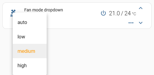
The dropdown under the name draws `fan_mode`'s icon. A template can pick a
different glyph per mode; `items` is data the template reads back through
`this` as `this.icon.items`, because the context is the whole `fan_mode`
option, not the nested `icon` object. See [`this`](https://artem-sedykh.github.io/mini-climate-card/functions/#this). Hide
the fan_mode button so the same control is not on the card twice.
A string on `secondary_info.icon` replaces this and freezes the glyph, which
is why that key is left off here.
```yaml
type: custom:mini-climate
entity: climate.dahatsu
secondary_info: fan-mode-dropdown
fan_mode:
hide: true
icon:
items:
auto: 'mdi:fan-auto'
low: 'mdi:fan-speed-1'
medium: 'mdi:fan-speed-2'
high: 'mdi:fan-speed-3'
template: >
(state) => this.icon.items[state] || 'mdi:fan'
source:
auto: Automatic
low: Gentle
medium: Middling
high: Strong
```
---
# Examples
Source: https://artem-sedykh.github.io/mini-climate-card/examples/
> This is a configuration example for my air conditioner, built on [esphome](https://github.com/esphome/esphome).
```yaml
type: custom:mini-climate
entity: climate.dahatsu
name: Air conditioner
fan_mode:
source:
auto: Auto
low: Low
medium: Medium
high: High
# for my implementation fan_modes_al is an array of available fan modes of the selected hvac mode
__filter: >
(source, state, entity) => entity.attributes
.fan_modes_al.map(fan_mode => source.find(s => s.id === fan_mode))
.filter(fan_mode => fan_mode)
buttons:
swing_mode:
type: dropdown
icon: mdi:approximately-equal
state:
attribute: swing_mode
# the drop-down list will remain active until swing_mode is off
active: state => state !== 'off'
source:
'off': Off
horizontal: On
change_action: >
(selected, state, entity) => this.call_service('climate', 'set_swing_mode', { entity_id: entity.entity_id, swing_mode: selected })
# turbo air conditioning button
turbo:
icon: mdi:weather-hurricane
# control topic
topic: 'dahatsu/turbo/set'
state:
attribute: turbo
# for my device, the turbo attribute returns boolean type, convert it to on or off
mapper: "(state, entity) => state ? 'on': 'off'"
# turbo button is not available for all modes, block it when it is not available
disabled: (state, entity) => !entity.attributes.turbo_al
# when you click on the button, send the event to mqtt
toggle_action: >
(state) => this.call_service('mqtt', 'publish', { payload: this.toggle_state(state), topic: this.topic, retain: false, qos: 1 })
# eco button configuration is the same as for turbo button
eco:
icon: mdi:leaf
topic: 'dahatsu/eco/set'
state:
attribute: eco
mapper: "(state, entity) => state ? 'on': 'off'"
disabled: (state, entity) => !entity.attributes.eco_al
toggle_action: >
(state) => this.call_service('mqtt', 'publish', { payload: this.toggle_state(state), topic: this.topic, retain: false, qos: 1 })
# health button configuration is the same as for turbo button
health:
icon: mdi:emoticon-happy-outline
topic: 'dahatsu/health/set'
state:
attribute: health
mapper: "(state, entity) => state ? 'on': 'off'"
disabled: (state, entity) => !entity.attributes.health_al
toggle_action: >
(state) => this.call_service('mqtt', 'publish', { payload: this.toggle_state(state), topic: this.topic, retain: false, qos: 1 })
# power off button
power_switch:
icon: mdi:power-plug
state:
entity: switch.air_conditioner_kitchen_switch_l1
indicators:
# humidity indicator
humidity:
icon: mdi:water
unit: '%'
round: 1
source:
entity: sensor.sensor_temp_hum_pre_kitchen_humidity
# power consumption indicator
power_consumption:
icon: mdi:flash
unit: 'W'
round: 1
source:
entity: sensor.dahatsu_power
# power indicator
power:
icon: mdi:power-plug
source:
entity: switch.air_conditioner_kitchen_switch_l1
values:
'on': 'on'
'off': 'off'
# localization of values
mapper: value => this.source.values[value]
```
## Recipes
Things this tracker has been asked for more than once, with the answer and
what it looks like.
Each is also a card on the bench and an assertion in `test/e2e/`, so an answer
that stops being true fails a run rather than sitting here reading well.
### A card with nothing but the temperature
Everything that can be hidden, hidden - the icon, the name, the fan mode, the
secondary info line and the toggle. What is left is the temperature and the
buttons that change it.
```yaml
type: custom:mini-climate
entity: climate.bedroom
name: ' '
hide_icon: true
toggle:
hide: true
fan_mode:
hide: true
secondary_info:
hide: '() => true'
```

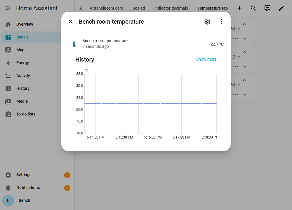
### The sensor behind the temperature, one tap away
When the current temperature is read from a sensor of its own, that sensor has
a history the card led nowhere to: the card's own `tap_action` is on the entity
name and opens the climate entity, and the reading itself was not clickable at
all. `temperature.tap_action` opens the entity the reading comes from.
```yaml
type: custom:mini-climate
entity: climate.bedroom
temperature:
source:
entity: sensor.bedroom_temperature
tap_action: more-info
```
Both readings take one, and each can name an `entity` of its own - which is how
one card opens two different dialogs. Neither is clickable until it is
configured, so a card that says nothing about this keeps behaving exactly as it
did. The rest of what a tap can do - navigate, call a service, fire a
dom-event - is on the [tap action](https://artem-sedykh.github.io/mini-climate-card/tap-action/#temperature-and-target-temperature)
page.
### An indicator with an icon and no value
There is no option for this, and none is needed: the value carries a `style`,
and a style can hide it. The unit goes with it.
```yaml
indicators:
window:
source:
entity: binary_sensor.bedroom_window
icon:
template: "(value) => (value === 'on' ? 'mdi:window-open' : 'mdi:window-closed')"
style: "(value) => (value === 'on' ? { color: 'orange' } : {})"
value:
style: "() => ({ display: 'none' })"
```

### A shortened value
A `mapper` runs on every value the indicator reads, so anything that is a
string can be cut, rounded or relabelled on the way to the card.
```yaml
indicators:
clock:
icon: mdi:clock-outline
source:
entity: sensor.bedroom_clock
mapper: "value => (typeof value === 'string' ? value.slice(0, 5) : value)"
```

### The mode icon coloured by the mode it shows
`hvac_mode.style` receives the mode as the first argument (`value`) and the
entity as the second. Colour the icon by the mode - `cool`/`heat`/anything
else - so the icon and its colour always agree.
**The `!important` is what makes this work on a unit that is running.** While
the climate entity is on, the card marks the mode button active and paints it
with a rule of its own that is already `!important`; an inline style without
one loses to it, and the colour appears only while the unit is off.
```yaml
hvac_mode:
style: >
(value, entity) => ({
color: value === 'cool'
? 'blue !important'
: value === 'heat'
? 'red !important'
: 'grey !important',
})
```

### The mode icon coloured by what the unit is doing
`hvac_action` is what the unit is doing now - heating, cooling, idle - as
against the mode above, which is what it was asked to do. A style template is
handed the entity as its second argument, so both are in reach: colour by
`hvac_action` when the question is what is happening rather than what was set.
The `!important` is needed for the same reason as above, and note that
`hvac_action` is optional - an entity that does not report it leaves every
branch here on the fallback.
```yaml
hvac_mode:
style: >
(value, entity) => ({
color: entity.attributes.hvac_action === 'cooling'
? 'blue !important'
: entity.attributes.hvac_action === 'heating'
? 'red !important'
: 'grey !important',
})
```

### The entity icon following what the unit is doing
The left icon is a string by default, and its tint follows HVAC mode
(`isActive`), so a thermostat that stays in `heat` looks on even while
`hvac_action` is idle. That is [#38](https://github.com/artem-sedykh/mini-climate-card/issues/38)
and the same hole as [#42](https://github.com/artem-sedykh/mini-climate-card/issues/42)
for `preset_mode`.
`icon` takes the `{ template, style }` object indicators already have.
Arguments are `(climate_entity, hvac_mode)`, matching `hide_icon`. When
`style` is present it owns the colour, so idle can look idle; the entity
icon's colour rule is not `!important`, unlike the mode icon above.
```yaml
icon:
template: >
(entity) => entity.attributes.hvac_action === 'heating'
? 'mdi:radiator'
: entity.attributes.hvac_action === 'cooling'
? 'mdi:snowflake'
: 'mdi:radiator-off'
style: >
(entity) => ({
color: entity.attributes.hvac_action === 'heating'
? 'rgb(255, 0, 0)'
: entity.attributes.hvac_action === 'cooling'
? 'rgb(0, 0, 255)'
: 'rgb(128, 128, 128)',
})
```

### Indicators that line up in a stack
`round` gives a number, so a reading with nothing left after the decimal point
loses it: at `round: 1` a temperature of 24 reads `24`, while 21.5 reads
`21.5`. The value is then narrower on one card than on the other, and every
indicator to the right of it shifts along. Put a few of these cards above one
another and the columns are ragged.
`fixed` shows the decimals whether there is anything in them or not, so the
width stops depending on the reading.
```yaml
type: custom:mini-climate
entity: climate.thermostat
indicators:
temperature:
icon: mdi:thermometer
unit: "°C"
fixed: 1
source:
attribute: current_temperature
humidity:
icon: mdi:water-percent
unit: "%"
fixed: 1
source:
entity: sensor.room_humidity
```
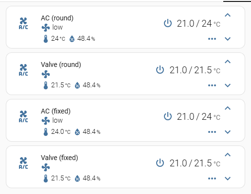
The top two cards use `round: 1`. One of them reads a whole 24 degrees, so its
value is the narrower of the two and its humidity sits 11px to the left of the
card below it. The bottom two use `fixed: 1`: 24 reads `24.0`, and the columns
line up.
Both leave a reading that is not a number alone, so a sensor that goes
`unavailable` reads `unavailable` rather than `NaN`.
### A press instead of the mode dropdown
The mode control is a dropdown and nothing else: `hvac_mode` is built like any
other button, but the card always draws it as a menu, so `type` on it is not
read. On a unit with two modes that is a list of two to choose from where a
press would do.
The card does not have to change for it. Hide the dropdown and put an ordinary
button where it stood: `location: main` is what puts a button in the top row
rather than behind the toggle, and an `icon` template makes the one button show
both halves of the switch.
```yaml
type: custom:mini-climate
entity: climate.greenhouse
hvac_mode:
hide: true
buttons:
hvac_toggle:
type: button
location: main
order: 0
icon:
template: "state => (state === 'off' ? 'mdi:power' : 'mdi:fire')"
toggle_action: >
(state, entity) => this.call_service('climate', 'set_hvac_mode', { entity_id: entity.entity_id, hvac_mode: state === 'off' ? 'heat' : 'off' })
```
A button with no `state` of its own reads the climate entity's, which for a
climate entity is the mode - so `off` leaves the button dark and any other mode
lights it, with no `active` written for it. A unit with more than two modes
wants the dropdown; this trades the choice for the press.

### The mode under the name, with its label
The mode control in the top row is an icon: it opens a list, and what it is
showing has to be read off the glyph. The line under the entity name can hold a
control with its **name** on it - that is what `secondary_info:
fan-mode-dropdown` does for the fan speed - and `fan_mode` is a button like any
other, so it can be pointed at the modes instead.
```yaml
type: custom:mini-climate
entity: climate.bedroom
hvac_mode:
hide: true
secondary_info:
type: fan-mode-dropdown
fan_mode:
icon: mdi:thermostat
# the entity's own state, not the fan_mode attribute
state: {}
source:
'off': Off
heat: Heat
cool: Cool
dry: Dry
change_action: >
(selected, state, entity) => this.call_service('climate', 'set_hvac_mode', { entity_id: entity.entity_id, hvac_mode: selected })
```
Three things worth knowing:
- `hvac_mode: hide` is not optional decoration - without it the card shows the
mode twice, once in each place;
- the names are yours. The built-in mode control takes them from Home
Assistant's own translations; this one shows the `source` you write, so it is
also how a mode gets a name of your choosing;
- the card now has no fan speed control, because `fan_mode` is what was
repurposed. A unit with fan modes wants a button of its own for them.
And the trap that costs the most time here: a button's `change_action` is
handed `(selected_value, state, entity, ...)`. Written as `(selected, entity)`
the second argument is the state, `entity.entity_id` is undefined, the service
call goes out without an entity, Home Assistant refuses it - and **the
dashboard shows nothing at all**. The message reaches the browser console and
nowhere else.
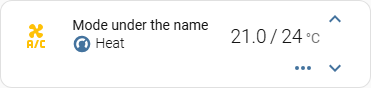
### The fan mode in the top row
`fan_mode` is a button like any other - `setConfig` pushes it into `buttons`
under that id - so the same `location` moves it. `main` takes the dropdown out
of the toggle panel and puts it in the control row beside the mode icon; with
nothing left behind the toggle, the chevron that opened it goes as well and the
card is one row.
```yaml
type: custom:mini-climate
entity: climate.bedroom
fan_mode:
location: main
order: 0
secondary_info: hvac-action
```
The `secondary_info` line is not decoration here. It shows the fan mode by
default, so a card that moves the dropdown up says the same thing in two
places - give the line something else to say, `hvac-action` above or any other
type in [Secondary info](https://artem-sedykh.github.io/mini-climate-card/secondary-info/).

### An indicator coloured by the mode
The third argument every template gets is the **climate entity**, whatever
entity the indicator itself is reading. That is what to reach for here: an
indicator on a floor sensor has no `hvac_action` of its own.
```yaml
indicators:
floor:
source:
entity: binary_sensor.floor_demand
unit: '%'
icon:
template: "() => 'mdi:heating-coil'"
style: >
(value, entity, climate_entity) => ({
color: climate_entity.state === 'cool' ? 'blue' : 'red',
})
```

### A row of preset buttons
One climate entity holds **one** preset at a time, so a row of preset buttons
is a set of switches rather than a list. Each button maps the attribute to
on/off and sends the chosen value on press; `active` decides which one is lit.
```yaml
type: custom:mini-climate
entity: climate.pass_actuator_3
buttons:
eco:
icon: mdi:leaf
state:
attribute: preset_mode
mapper: state => state === 'eco' ? 'on' : 'off'
active: state => state === 'on'
toggle_action: >
(state, entity) => this.call_service('climate', 'set_preset_mode', { entity_id: entity.entity_id, preset_mode: state === 'on' ? 'none' : 'eco' })
boost:
icon: mdi:weather-hurricane
state:
attribute: preset_mode
mapper: state => state === 'boost' ? 'on' : 'off'
active: state => state === 'on'
toggle_action: >
(state, entity) => this.call_service('climate', 'set_preset_mode', { entity_id: entity.entity_id, preset_mode: state === 'on' ? 'none' : 'boost' })
```
Two things worth knowing:
- the buttons sit behind the toggle, like every other button, unless one is
given `location: main`;
- after pressing one there is a moment where no button is lit - the old preset
goes out before the new one comes in. On a slow connection that is visible;
it settles.
To show the selected preset's **name** as well, add an indicator reading
`attribute: preset_mode` - that is [A shortened value](#a-shortened-value)'s
`values` + `mapper`, applied to `preset_mode`.
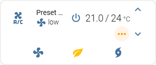
### A spacer that keeps the slot
`hide` takes a button out of the row, and the ones that remain slide together.
A shared template across several climate entities - some of which have an extra
button and some of which do not - then fails to line up.
There is no spacer option. A dummy button that stays in the row, with its icon
hidden, keeps the slot. The names are keys in `buttons:`, so two spacers need
two names:
```yaml
buttons:
spacer_1:
style: "() => ({ visibility: 'hidden' })"
spacer_2:
style: "() => ({ visibility: 'hidden' })"
```
The extra parentheses around the object are required: without them the arrow's
braces are a block, the function returns nothing, and the icon stays visible.
`hide` is the wrong tool here - it is what collapses the row.
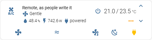
### A translucent card
Setting `background` on `ha-card` is the obvious way to do this, it is what
works on other cards, and here it does nothing visible. The card does not paint
its background on `ha-card` - it leaves that transparent and paints a layer of
its own over it. The rule applies; the layer covers it.
What the layer reads is `--ha-card-background`, along with Home Assistant's
other card variables. In a theme:
```yaml
glass:
# something for the card to be translucent against
lovelace-background: 'linear-gradient(135deg, #3a6186 0%, #89253e 100%)'
ha-card-background: 'rgba(0, 0, 0, 0.5)'
ha-card-border-width: 0
ha-card-border-radius: 10px
mini-climate-card-box-shadow: none
# the card's own text and icons, which stop being readable on a dark card
mini-climate-base-color: '#ffffff'
mini-climate-icon-color: '#ffffff'
mini-climate-button-color: '#ffffff'
```
Themes apply to a dashboard, a view or a user. For a single card the same
variables go on the card itself, which needs
[card_mod](https://github.com/thomasloven/lovelace-card-mod) - note `:host`,
not `ha-card`:
```yaml
type: custom:mini-climate
entity: climate.bedroom
card_mod:
style: |
:host {
--ha-card-background: rgba(0, 0, 0, 0.5);
--ha-card-border-width: 0;
--mini-climate-base-color: #ffffff;
}
```
`--mini-climate-background-opacity` is a second knob on the same layer, and it
multiplies with the alpha above rather than replacing it. Set one or the other.
The theme is the half that is on the bench; the `card_mod` half is not, because
`card_mod` is not installed there.

### A bigger card
For a wall panel, where the card is read from across the room rather than from
a desk. `scale` multiplies the unit everything on the card is measured in - the
type, the icons, the buttons and the spacing between them - so there is one
number to set rather than a stylesheet to write:
```yaml
type: custom:mini-climate
entity: climate.bedroom
scale: 2
```
The same number is available as a theme variable, `mini-climate-scale`, for
when every card on a dashboard should be the same size.
Two things to know before turning it up:
- **A scaled card needs width.** Everything grows, and in a narrow masonry
column the entity name is the first thing to run out of room and be cut to an
ellipsis - which is what the picture below shows at `scale: 2`. Give the card
a column of its own, or a panel view, or shorten the name.
- **The padding around the card does not scale**, only its contents. At a large
scale the card looks tighter than it does at 1.
Before v3.2.0 `scale` grew the type and left the icons at 24px, so a scaled card
came out with a large name beside small chevrons ([#287](https://github.com/artem-sedykh/mini-climate-card/issues/287)).
If that is what you are seeing, the card is older than the fix.
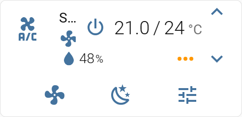
---
# AI assistants
Source: https://artem-sedykh.github.io/mini-climate-card/ai-assistants/
> Writing a card with Claude, Cursor, ChatGPT or anything else of the kind.
This card is configured rather than coded, which makes it a good fit for an
assistant - and it is a small project, which makes it a bad one. None of them
know the options here, so what comes back looks right and names things the card
does not have.
Two steps fix most of that: give the assistant this documentation, and know how
this card behaves when a configuration is wrong.
## Give it the documentation
The whole site is published in a form made for reading in one go:
| | |
|---|---|
| [llms.txt](https://artem-sedykh.github.io/mini-climate-card/llms.txt) | the index - every page with a line saying what is on it |
| [llms-full.txt](https://artem-sedykh.github.io/mini-climate-card/llms-full.txt) | every page, concatenated |
Both are generated from the pages themselves at build time, so they are never
a stale copy of the documentation.
There are three ways in, and which one you have depends on the tool rather than
on the card.
**An assistant that can fetch a URL** - Claude, ChatGPT with browsing, most
editor agents - only needs to be told which one:
```text
Read https://artem-sedykh.github.io/mini-climate-card/llms-full.txt - it is the
full documentation of the mini-climate-card Lovelace card.
Write me a card for climate.bedroom that shows the humidity from
sensor.bedroom_humidity, hides the fan mode, and turns the mode icon red while
the unit is heating.
Only use options that appear in the Configuration table of that documentation.
Templates are arrow functions written as strings. Answer with the YAML only.
```
The last paragraph is the part that does the work. Without it an assistant
tends to write the card first and consult the documentation afterwards, if at
all.
**An assistant working in your files** - Cursor, Claude Code, anything with a
terminal - is better off with the file beside the configuration it is editing,
where it stays for the next question:
```bash
curl -o mini-climate-card-docs.md \
https://artem-sedykh.github.io/mini-climate-card/llms-full.txt
```
Then: `read mini-climate-card-docs.md, then add a preset row to the card in
ui-lovelace.yaml`.
**An assistant that cannot reach the network** takes the file pasted into the
conversation. It is the documentation and nothing else - no code, no history -
and it is around 100 KB, which every current assistant holds without trouble.
## Make it show its work
One follow-up catches most of what goes wrong, and it costs one line:
```text
For every option in the YAML you just wrote, quote the line of the documentation
that defines it. Delete any option you cannot quote.
```
An invented option has nothing to quote, and this is the point where that
becomes visible - rather than on the dashboard, where a wrong option is silent
(see below). It works because the documentation is in the conversation: ask the
same thing of an assistant that never read it and you get invented quotes to go
with the invented options.
When something does not work, the console message is the thing to paste back:
```text
Home Assistant logged this for the card: .
Which option is wrong, and what does the documentation say it should be?
```
## Then check what comes back
Four things about this card that an assistant tends to get wrong. Each one was
a real question in the tracker, which is why they are worth checking first:
- **The mode control is always a dropdown.** `hvac_mode` is built like a button
and rendered as a menu, so `type: button` on it is read by nothing. To press
the mode rather than pick it, hide it and put a button in its place -
[A press instead of the mode dropdown](https://artem-sedykh.github.io/mini-climate-card/examples/#a-press-instead-of-the-mode-dropdown).
- **A template has to be an arrow function.** `state => ...`, not
`function (state) { ... }`. The card compiles the text and calls it with a
context bound to `this`; a `function` expression gets its own `this` and sees
none of it. Every example in these pages is an arrow.
- **An unknown key is not an error.** The configuration is open at the leaves -
anything written beside a template is handed to that template as
`this.`, which is how options of your own are passed in. Nested maps keep
their path (`this.icon.items`, not `this.items`). The cost is that a
misspelled option is not rejected, it just never does anything. See
[`this`](https://artem-sedykh.github.io/mini-climate-card/functions/#this).
- **A broken configuration is a red square.** Home Assistant draws
`hui-error-card`, 56px high, and shows no message on it - the text goes to
the browser console. If a card renders as a red bar, open the console before
anything else.
And the rule that catches most of the rest: **every option this card has is a
row in the table in [Configuration](https://artem-sedykh.github.io/mini-climate-card/configuration/)**. If an assistant names
one that is not in that table, it does not exist, however plausible it looks.
## What is worth asking for
An assistant is at its best here on the parts that are tedious rather than
uncertain: a set of indicators reading half a dozen sensors, a row of buttons
that all call the same service with a different value, a `source` list renamed
into another language, or a template that maps a value onto an icon.
It is at its worst on what the card actually does with all that. When something
does not work, the fastest way through is usually not another round with the
assistant: check the option against the table, look at the console, and compare
against the recipe closest to what you want in [Examples](https://artem-sedykh.github.io/mini-climate-card/examples/).
Not everything has to be YAML, either: the [visual
editor](https://artem-sedykh.github.io/mini-climate-card/visual-editor-parameters/) covers the common options, and it cannot
invent a name.
## If it still does not work
Open an issue with the configuration exactly as you are running it, the card
version from the console banner, and the Home Assistant version. A
configuration written by an assistant is welcome here - say so if it was, and
what you asked for. That is useful rather than embarrassing: it tells us which
part of these pages an assistant misread, and that is a documentation bug on
our side.
---
# Development
Source: https://artem-sedykh.github.io/mini-climate-card/development/
*If you plan to contribute back to this repo, please fork & create the PR against the [dev](https://github.com/artem-sedykh/mini-climate-card/tree/dev) branch.*
**Clone this repository into your `config/www` folder using git.**
```console
$ git clone https://github.com/artem-sedykh/mini-climate-card.git
```
**Add a reference to the card in your `ui-lovelace.yaml`.**
```yaml
resources:
- url: /local/mini-climate-card/dist/mini-climate-card-bundle.js
type: module
```
## Instructions
*Requires `nodejs` & `npm`*
1. Move into the `mini-climate-card` repo, checkout the *dev* branch & install dependencies.
```console
$ cd mini-climate-card && git checkout dev && npm install
```
2. Make changes to the source
3. Build the source by running
```console
$ npm run build
```
4. Refresh the browser to see changes
*Make sure cache is cleared or disabled*
5. *(Optional)* Watch the source and automatically rebuild on save
```console
$ npm run watch
```
*The new `mini-climate-card-bundle.js` will be build and ready inside `/dist`.*
## Getting errors?
Make sure you have `javascript_version: latest` in your `configuration.yaml` under `frontend:`.
Make sure you have the latest version of `mini-climate-card-bundle.js`.
If you have issues after updating the card, try clearing your browsers cache or restart Home Assistant.
If you are getting "Custom element doesn't exist: mini-climate" or running older browsers try replacing `type: module` with `type: js` in your resource reference, like below.
```yaml
resources:
- url: ...
type: js
```
---
# Visual editor
Source: https://artem-sedykh.github.io/mini-climate-card/visual-editor-parameters/
The following parameters are configurable via the built-in visual (UI) editor.
Parameters that require JavaScript function strings (`change_action`, `active`, `style`, etc.) remain YAML-only.
---
## Basic
| Parameter | Type | Description |
|---|---|---|
| `entity` | entity picker | Required. Climate or fan entity (`climate.*` / `fan.*`) |
| `name` | text | Optional override for the entity's friendly name |
| `icon` | icon picker | Custom MDI icon (e.g. `mdi:air-conditioner`). A `{ template, style }` object is YAML-only: the picker is omitted so it cannot overwrite it |
| `group` | toggle | Remove card background, padding and box-shadow |
| `scale` | number (0.5 - 3) | UI scale modifier (affects `--mc-unit` CSS variable) |
| `swap_temperatures` | toggle | Swap the current and target temperature positions |
| `hide_current_temperature` | toggle | Hide the current temperature reading |
---
## Tap Action
| Parameter | Type | Description |
|---|---|---|
| `tap_action.action` | select | Action on name/icon tap: `more-info`, `navigate`, `call-service`, `url`, `fire-dom-event`, `none` |
| `tap_action.navigation_path` | text | Path to navigate to (used when action = `navigate`, e.g. `/lovelace/0/`) |
| `tap_action.url` | text | URL to open (used when action = `url`) |
---
## Secondary Info
| Parameter | Type | Description |
|---|---|---|
| `secondary_info.type` | select | Display type: `fan-mode`, `fan-mode-dropdown`, `hvac-mode`, `hvac-action`, `last-changed`, `last-updated` |
| `secondary_info.hide` | toggle | Hide the secondary info row |
| `secondary_info.icon` | icon picker | Custom icon shown next to the secondary info text |
---
## Toggle Panel Button
Controls the `...` button that expands/collapses the bottom button panel.
| Parameter | Type | Description |
|---|---|---|
| `toggle.hide` | toggle | Hide the toggle button entirely |
| `toggle.default` | toggle | Start with the button panel expanded by default |
| `toggle.icon` | icon picker | Custom icon for the toggle button (default `mdi:dots-horizontal`) |
---
## Temperature Display
| Parameter | Type | Description |
|---|---|---|
| `temperature.unit` | select / text | Display unit: `°C` or `°F` (custom value supported) |
| `temperature.round` | number (0 - 5) | Number of decimal places to round the displayed value |
---
## Target Temperature
| Parameter | Type | Description |
|---|---|---|
| `target_temperature.unit` | select / text | Display unit: `°C` or `°F` (custom value supported) |
| `target_temperature.min` | number | Minimum allowed set-point (overrides entity `min_temp`) |
| `target_temperature.max` | number | Maximum allowed set-point (overrides entity `max_temp`) |
| `target_temperature.step` | number (0.1 - 5) | Temperature change step (overrides entity `target_temp_step`) |
| `target_temperature.icons.up` | icon picker | Icon for the increase-temperature button (default `mdi:chevron-up`) |
| `target_temperature.icons.down` | icon picker | Icon for the decrease-temperature button (default `mdi:chevron-down`) |
---
## HVAC Mode
| Parameter | Type | Description |
|---|---|---|
| `hvac_mode.hide` | toggle | Hide the HVAC mode dropdown |
---
## Fan Mode
| Parameter | Type | Description |
|---|---|---|
| `fan_mode.icon` | icon picker | Custom icon for the fan mode button (default `mdi:fan`) |
| `fan_mode.hide` | toggle | Hide the fan mode button |
| `fan_mode.location` | select | Where the button appears: `bottom` (toggle panel) or `main` (top control row) |
---
## Parameters NOT available in the UI (YAML only)
The following require JavaScript function strings and must be configured in YAML:
- All `change_action`, `toggle_action`, `active`, `disabled`, `style`, `mapper`, `hide` **(function form)** on any object
- `hvac_mode.source` - per-mode icon/name/order/hide customisation
- `fan_mode.source` / `fan_mode.source.__filter`
- `target_temperature.change_action`
- `secondary_info.source` - per-hvac-action icon/name customisation
- `buttons` - custom button/dropdown definitions
- `indicators` - sensor chip definitions
- `temperature.source.entity` / `temperature.source.attribute`
- `target_temperature.source.entity` / `target_temperature.source.attribute`