Examples
This is a configuration example for my air conditioner, built on esphome.
type: custom:mini-climate
entity: climate.dahatsu
name: Air conditioner
fan_mode:
  source:
    auto: Auto
    low: Low
    medium: Medium
    high: High
    # for my implementation fan_modes_al is an array of available fan modes of the selected hvac mode
    __filter: >
      (source, state, entity) => entity.attributes
        .fan_modes_al.map(fan_mode => source.find(s => s.id === fan_mode))
        .filter(fan_mode => fan_mode)
buttons:
  swing_mode:
    type: dropdown
    icon: mdi:approximately-equal
    state:
      attribute: swing_mode
    # the drop-down list will remain active until swing_mode is off
    active: state => state !== 'off'
    source:
      'off': Off
      horizontal: On
    change_action: >
      (selected, state, entity) => this.call_service('climate', 'set_swing_mode', { entity_id: entity.entity_id, swing_mode: selected })
  # turbo air conditioning button
  turbo:
    icon: mdi:weather-hurricane
    # control topic
    topic: 'dahatsu/turbo/set'
    state:
      attribute: turbo
      # for my device, the turbo attribute returns boolean type, convert it to on or off
      mapper: "(state, entity) => state ? 'on': 'off'"
    # turbo button is not available for all modes, block it when it is not available
    disabled: (state, entity) => !entity.attributes.turbo_al
    # when you click on the button, send the event to mqtt
    toggle_action: >
      (state) => this.call_service('mqtt', 'publish', { payload: this.toggle_state(state), topic: this.topic, retain: false, qos: 1 })
  # eco button configuration is the same as for turbo button
  eco:
    icon: mdi:leaf
    topic: 'dahatsu/eco/set'
    state:
      attribute: eco
      mapper: "(state, entity) => state ? 'on': 'off'"
    disabled: (state, entity) => !entity.attributes.eco_al
    toggle_action: >
      (state) => this.call_service('mqtt', 'publish', { payload: this.toggle_state(state), topic: this.topic, retain: false, qos: 1 })
  # health button configuration is the same as for turbo button
  health:
    icon: mdi:emoticon-happy-outline
    topic: 'dahatsu/health/set'
    state:
      attribute: health
      mapper: "(state, entity) => state ? 'on': 'off'"
    disabled: (state, entity) => !entity.attributes.health_al
    toggle_action: >
      (state) => this.call_service('mqtt', 'publish', { payload: this.toggle_state(state), topic: this.topic, retain: false, qos: 1  })
  # power off button
  power_switch:
    icon: mdi:power-plug
    state:
      entity: switch.air_conditioner_kitchen_switch_l1
indicators:
  # humidity indicator
  humidity:
    icon: mdi:water
    unit: '%'
    round: 1
    source:
      entity: sensor.sensor_temp_hum_pre_kitchen_humidity
  # power consumption indicator
  power_consumption:
    icon: mdi:flash
    unit: 'W'
    round: 1
    source:
      entity: sensor.dahatsu_power
  # power indicator
  power:
    icon: mdi:power-plug
    source:
      entity: switch.air_conditioner_kitchen_switch_l1
      values:
        'on': 'on'
        'off': 'off'
      # localization of values
      mapper: value => this.source.values[value]
Recipes
Things this tracker has been asked for more than once, with the answer and what it looks like.
Each is also a card on the bench and an assertion in test/e2e/, so an answer
that stops being true fails a run rather than sitting here reading well.
A card with nothing but the temperature
Everything that can be hidden, hidden - the icon, the name, the fan mode, the secondary info line and the toggle. What is left is the temperature and the buttons that change it.
type: custom:mini-climate
entity: climate.bedroom
name: ' '
hide_icon: true
toggle:
  hide: true
fan_mode:
  hide: true
secondary_info:
  hide: '() => true'

The sensor behind the temperature, one tap away
When the current temperature is read from a sensor of its own, that sensor has
a history the card led nowhere to: the card's own tap_action is on the entity
name and opens the climate entity, and the reading itself was not clickable at
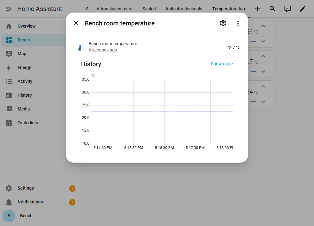
all. temperature.tap_action opens the entity the reading comes from.
type: custom:mini-climate
entity: climate.bedroom
temperature:
  source:
    entity: sensor.bedroom_temperature
  tap_action: more-info
Both readings take one, and each can name an entity of its own - which is how
one card opens two different dialogs. Neither is clickable until it is
configured, so a card that says nothing about this keeps behaving exactly as it
did. The rest of what a tap can do - navigate, call a service, fire a
dom-event - is on the tap action
page.
An indicator with an icon and no value
There is no option for this, and none is needed: the value carries a style,
and a style can hide it. The unit goes with it.
indicators:
  window:
    source:
      entity: binary_sensor.bedroom_window
    icon:
      template: "(value) => (value === 'on' ? 'mdi:window-open' : 'mdi:window-closed')"
      style: "(value) => (value === 'on' ? { color: 'orange' } : {})"
    value:
      style: "() => ({ display: 'none' })"

A shortened value
A mapper runs on every value the indicator reads, so anything that is a
string can be cut, rounded or relabelled on the way to the card.
indicators:
  clock:
    icon: mdi:clock-outline
    source:
      entity: sensor.bedroom_clock
      mapper: "value => (typeof value === 'string' ? value.slice(0, 5) : value)"

The mode icon coloured by the mode it shows
hvac_mode.style receives the mode as the first argument (value) and the
entity as the second. Colour the icon by the mode - cool/heat/anything
else - so the icon and its colour always agree.
The !important is what makes this work on a unit that is running. While
the climate entity is on, the card marks the mode button active and paints it
with a rule of its own that is already !important; an inline style without
one loses to it, and the colour appears only while the unit is off.
hvac_mode:
  style: >
    (value, entity) => ({
      color: value === 'cool'
        ? 'blue !important'
        : value === 'heat'
          ? 'red !important'
          : 'grey !important',
    })

The mode icon coloured by what the unit is doing
hvac_action is what the unit is doing now - heating, cooling, idle - as
against the mode above, which is what it was asked to do. A style template is
handed the entity as its second argument, so both are in reach: colour by
hvac_action when the question is what is happening rather than what was set.
The !important is needed for the same reason as above, and note that
hvac_action is optional - an entity that does not report it leaves every
branch here on the fallback.
hvac_mode:
  style: >
    (value, entity) => ({
      color: entity.attributes.hvac_action === 'cooling'
        ? 'blue !important'
        : entity.attributes.hvac_action === 'heating'
          ? 'red !important'
          : 'grey !important',
    })

The entity icon following what the unit is doing
The left icon is a string by default, and its tint follows HVAC mode
(isActive), so a thermostat that stays in heat looks on even while
hvac_action is idle. That is #38
and the same hole as #42
for preset_mode.
icon takes the { template, style } object indicators already have.
Arguments are (climate_entity, hvac_mode), matching hide_icon. When
style is present it owns the colour, so idle can look idle; the entity
icon's colour rule is not !important, unlike the mode icon above.
icon:
  template: >
    (entity) => entity.attributes.hvac_action === 'heating'
      ? 'mdi:radiator'
      : entity.attributes.hvac_action === 'cooling'
        ? 'mdi:snowflake'
        : 'mdi:radiator-off'
  style: >
    (entity) => ({
      color: entity.attributes.hvac_action === 'heating'
        ? 'rgb(255, 0, 0)'
        : entity.attributes.hvac_action === 'cooling'
          ? 'rgb(0, 0, 255)'
          : 'rgb(128, 128, 128)',
    })

Indicators that line up in a stack
round gives a number, so a reading with nothing left after the decimal point
loses it: at round: 1 a temperature of 24 reads 24, while 21.5 reads
21.5. The value is then narrower on one card than on the other, and every
indicator to the right of it shifts along. Put a few of these cards above one
another and the columns are ragged.
fixed shows the decimals whether there is anything in them or not, so the
width stops depending on the reading.
type: custom:mini-climate
entity: climate.thermostat
indicators:
  temperature:
    icon: mdi:thermometer
    unit: "°C"
    fixed: 1
    source:
      attribute: current_temperature
  humidity:
    icon: mdi:water-percent
    unit: "%"
    fixed: 1
    source:
      entity: sensor.room_humidity
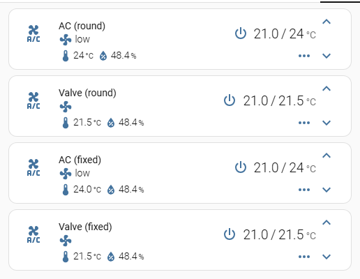
The top two cards use round: 1. One of them reads a whole 24 degrees, so its
value is the narrower of the two and its humidity sits 11px to the left of the
card below it. The bottom two use fixed: 1: 24 reads 24.0, and the columns
line up.
Both leave a reading that is not a number alone, so a sensor that goes
unavailable reads unavailable rather than NaN.
A press instead of the mode dropdown
The mode control is a dropdown and nothing else: hvac_mode is built like any
other button, but the card always draws it as a menu, so type on it is not
read. On a unit with two modes that is a list of two to choose from where a
press would do.
The card does not have to change for it. Hide the dropdown and put an ordinary
button where it stood: location: main is what puts a button in the top row
rather than behind the toggle, and an icon template makes the one button show
both halves of the switch.
type: custom:mini-climate
entity: climate.greenhouse
hvac_mode:
  hide: true
buttons:
  hvac_toggle:
    type: button
    location: main
    order: 0
    icon:
      template: "state => (state === 'off' ? 'mdi:power' : 'mdi:fire')"
    toggle_action: >
      (state, entity) => this.call_service('climate', 'set_hvac_mode', { entity_id: entity.entity_id, hvac_mode: state === 'off' ? 'heat' : 'off' })
A button with no state of its own reads the climate entity's, which for a
climate entity is the mode - so off leaves the button dark and any other mode
lights it, with no active written for it. A unit with more than two modes
wants the dropdown; this trades the choice for the press.

The mode under the name, with its label
The mode control in the top row is an icon: it opens a list, and what it is
showing has to be read off the glyph. The line under the entity name can hold a
control with its name on it - that is what secondary_info:
fan-mode-dropdown does for the fan speed, and hvac-mode-dropdown does for
the mode. The fan control stays a button of its own.
type: custom:mini-climate
entity: climate.bedroom
hvac_mode:
  hide: true
secondary_info: hvac-mode-dropdown
hvac_mode: hide is not optional decoration - without it the card shows the
mode twice, once in each place. The names are Home Assistant's own; a source
on hvac_mode replaces them, and takes a mode out of the list with hide -
see secondary info.
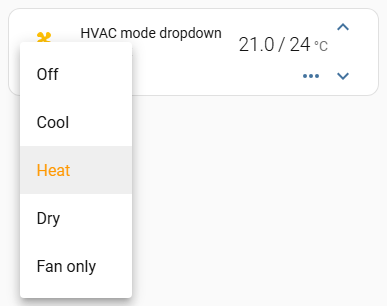
Before this type existed the same line was made by pointing fan_mode at the
modes. That recipe still works, and a card configured that way keeps working,
but it spends the fan control on it - which is what the type is for.
The fan mode in the top row
fan_mode is a button like any other - setConfig pushes it into buttons
under that id - so the same location moves it. main takes the dropdown out
of the toggle panel and puts it in the control row beside the mode icon; with
nothing left behind the toggle, the chevron that opened it goes as well and the
card is one row.
type: custom:mini-climate
entity: climate.bedroom
fan_mode:
  location: main
  order: 0
secondary_info: hvac-action
The secondary_info line is not decoration here. It shows the fan mode by
default, so a card that moves the dropdown up says the same thing in two
places - give the line something else to say, hvac-action above or any other
type in Secondary info.

An indicator coloured by the mode
The third argument every template gets is the climate entity, whatever
entity the indicator itself is reading. That is what to reach for here: an
indicator on a floor sensor has no hvac_action of its own.
indicators:
  floor:
    source:
      entity: binary_sensor.floor_demand
    unit: '%'
    icon:
      template: "() => 'mdi:heating-coil'"
      style: >
        (value, entity, climate_entity) => ({
          color: climate_entity.state === 'cool' ? 'blue' : 'red',
        })

A row of preset buttons
One climate entity holds one preset at a time, so a row of preset buttons
is a set of switches rather than a list. Each button maps the attribute to
on/off and sends the chosen value on press; active decides which one is lit.
type: custom:mini-climate
entity: climate.pass_actuator_3
buttons:
  eco:
    icon: mdi:leaf
    state:
      attribute: preset_mode
      mapper: state => state === 'eco' ? 'on' : 'off'
    active: state => state === 'on'
    toggle_action: >
      (state, entity) => this.call_service('climate', 'set_preset_mode', { entity_id: entity.entity_id, preset_mode: state === 'on' ? 'none' : 'eco' })
  boost:
    icon: mdi:weather-hurricane
    state:
      attribute: preset_mode
      mapper: state => state === 'boost' ? 'on' : 'off'
    active: state => state === 'on'
    toggle_action: >
      (state, entity) => this.call_service('climate', 'set_preset_mode', { entity_id: entity.entity_id, preset_mode: state === 'on' ? 'none' : 'boost' })
Two things worth knowing:
- the buttons sit behind the toggle, like every other button, unless one is
given
location: main; - after pressing one there is a moment where no button is lit - the old preset goes out before the new one comes in. On a slow connection that is visible; it settles.
To show the selected preset's name as well, add an indicator reading
attribute: preset_mode - that is A shortened value's
values + mapper, applied to preset_mode.
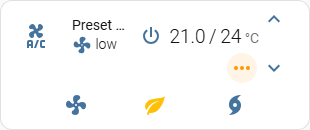
A spacer that keeps the slot
hide takes a button out of the row, and the ones that remain slide together.
A shared template across several climate entities - some of which have an extra
button and some of which do not - then fails to line up.
There is no spacer option. A dummy button that stays in the row, with its icon
hidden, keeps the slot. The names are keys in buttons:, so two spacers need
two names:
buttons:
  spacer_1:
    style: "() => ({ visibility: 'hidden' })"
  spacer_2:
    style: "() => ({ visibility: 'hidden' })"
The extra parentheses around the object are required: without them the arrow's
braces are a block, the function returns nothing, and the icon stays visible.
hide is the wrong tool here - it is what collapses the row.
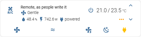
A translucent card
Setting background on ha-card is the obvious way to do this, it is what
works on other cards, and here it does nothing visible. The card does not paint
its background on ha-card - it leaves that transparent and paints a layer of
its own over it. The rule applies; the layer covers it.
What the layer reads is --ha-card-background, along with Home Assistant's
other card variables. In a theme:
glass:
  # something for the card to be translucent against
  lovelace-background: 'linear-gradient(135deg, #3a6186 0%, #89253e 100%)'
  ha-card-background: 'rgba(0, 0, 0, 0.5)'
  ha-card-border-width: 0
  ha-card-border-radius: 10px
  mini-climate-card-box-shadow: none
  # the card's own text and icons, which stop being readable on a dark card
  mini-climate-base-color: '#ffffff'
  mini-climate-icon-color: '#ffffff'
  mini-climate-button-color: '#ffffff'
Themes apply to a dashboard, a view or a user. For a single card the same
variables go on the card itself, which needs
card_mod - note :host,
not ha-card:
type: custom:mini-climate
entity: climate.bedroom
card_mod:
  style: |
    :host {
      --ha-card-background: rgba(0, 0, 0, 0.5);
      --ha-card-border-width: 0;
      --mini-climate-base-color: #ffffff;
    }
--mini-climate-background-opacity is a second knob on the same layer, and it
multiplies with the alpha above rather than replacing it. Set one or the other.
The theme is the half that is on the bench; the card_mod half is not, because
card_mod is not installed there.

A bigger card
For a wall panel, where the card is read from across the room rather than from
a desk. scale multiplies the unit everything on the card is measured in - the
type, the icons, the buttons and the spacing between them - so there is one
number to set rather than a stylesheet to write:
The same number is available as a theme variable, mini-climate-scale, for
when every card on a dashboard should be the same size.
Two things to know before turning it up:
- A scaled card needs width. Everything grows, and in a narrow masonry
column the entity name is the first thing to run out of room and be cut to an
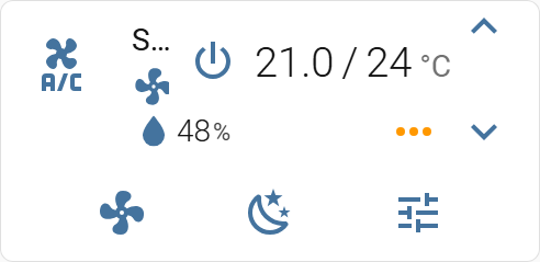
ellipsis - which is what the picture below shows at
scale: 2. Give the card a column of its own, or a panel view, or shorten the name. - The padding around the card does not scale, only its contents. At a large scale the card looks tighter than it does at 1.
Before v3.2.0 scale grew the type and left the icons at 24px, so a scaled card
came out with a large name beside small chevrons (#287).
If that is what you are seeing, the card is older than the fix.